Versions Compared

Key

  • This line was added.
  • This line was removed.
  • Formatting was changed.
Sv translation
languageen


Note

You need to be in edit mode in order to create new table. Click on "Edit" in top report menu to activate edit mode.

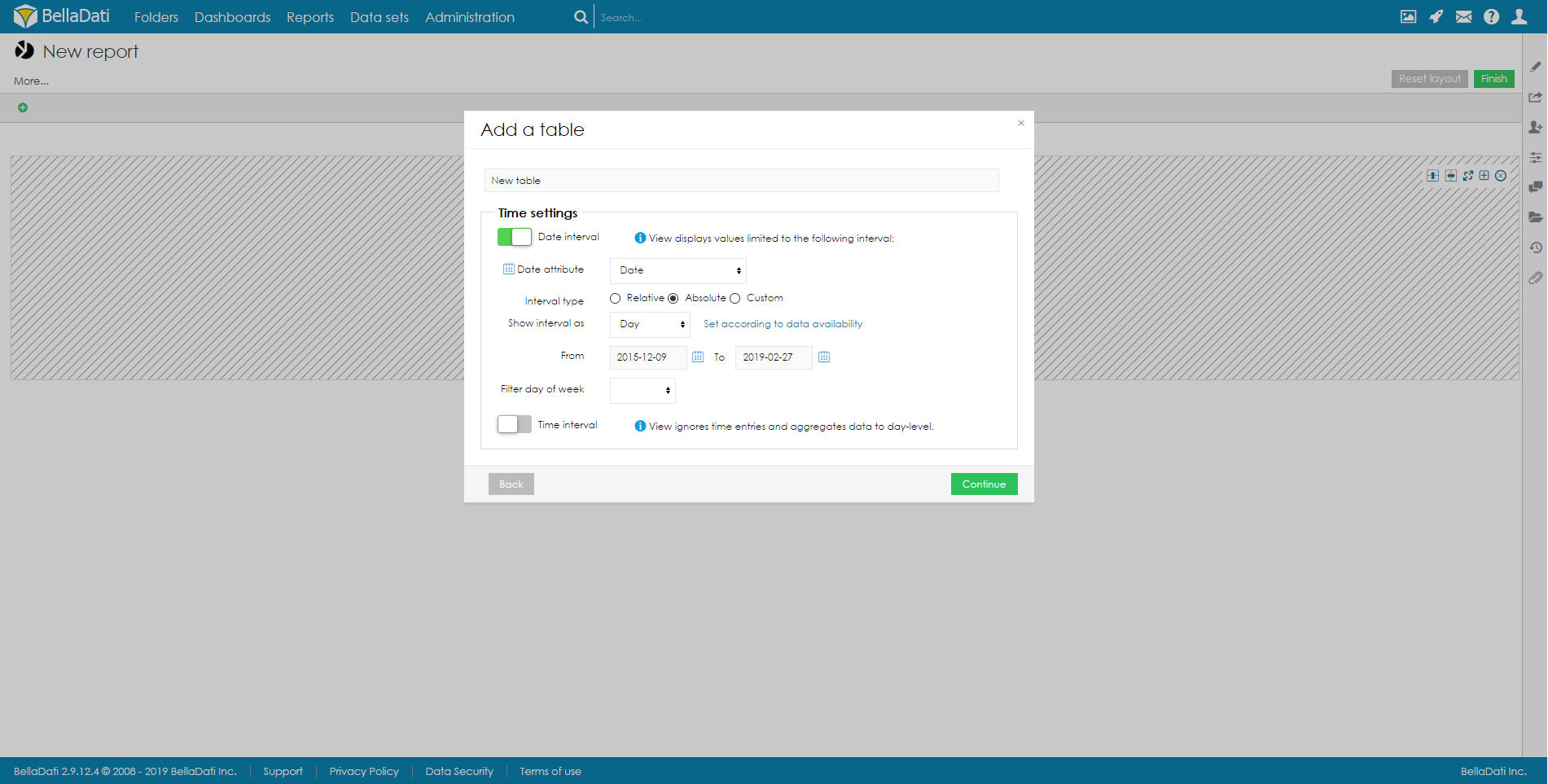
To add a new Table, hover over free place and click on Table view type. The Add a table dialog box will appear.

  1. Enter name of the new table.
  2. Check Date interval if you need to restrict time period of displayed data - continue by Setting Date Interval .

Confirm new Table view by clicking on a green Continue button. BellaDati will guide you through additional setup.
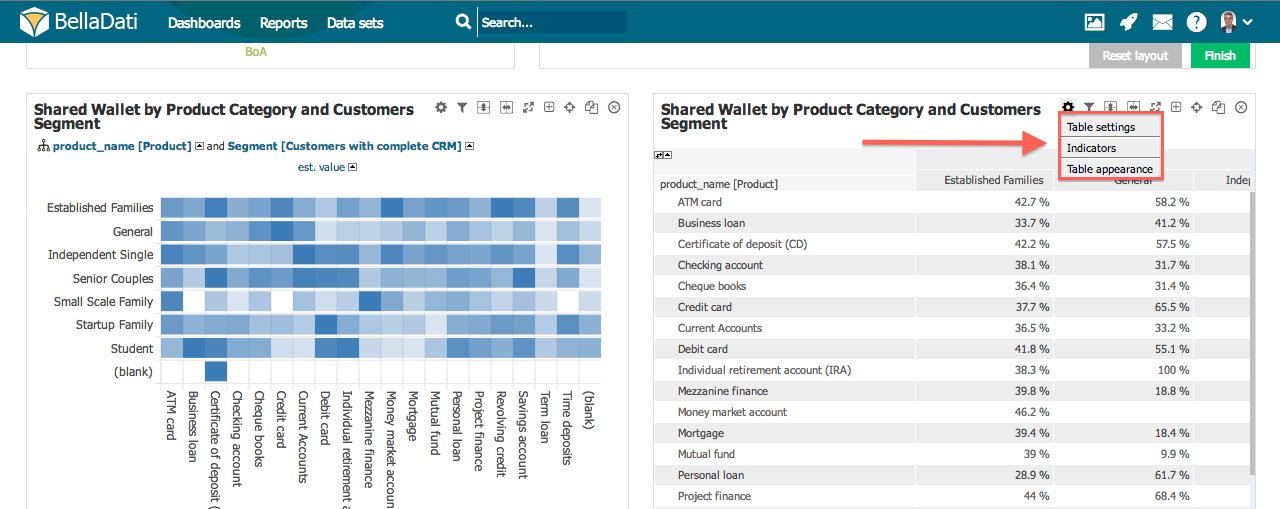
Tip

You can create also table without any indicators. This is useful for "static"

items lists reports (especially in conjunction with more drill-downs and hiding drill-down "+" signs).

Table management

You can perform additional operations in the upper right corner of the inserted Table view:
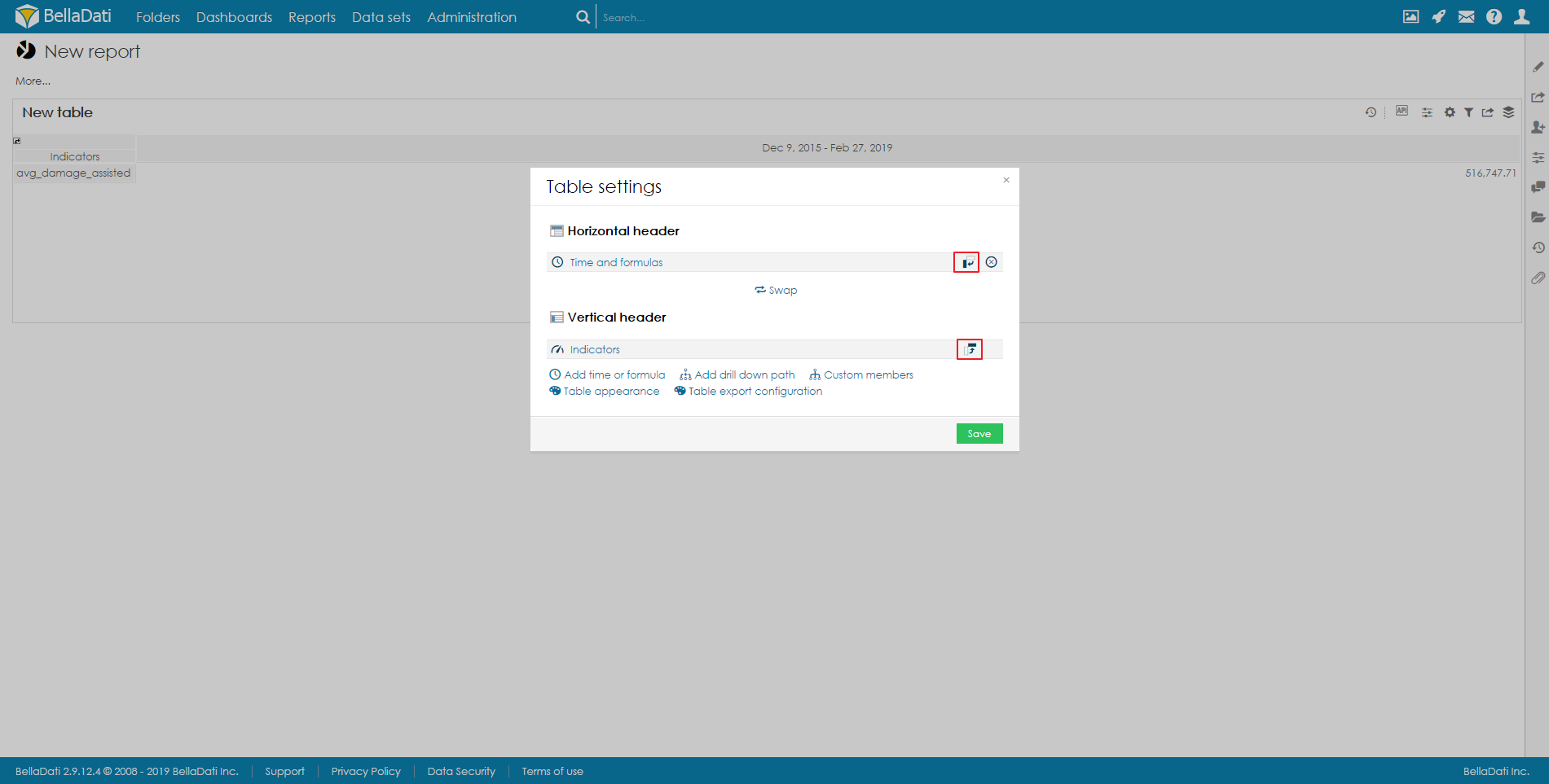
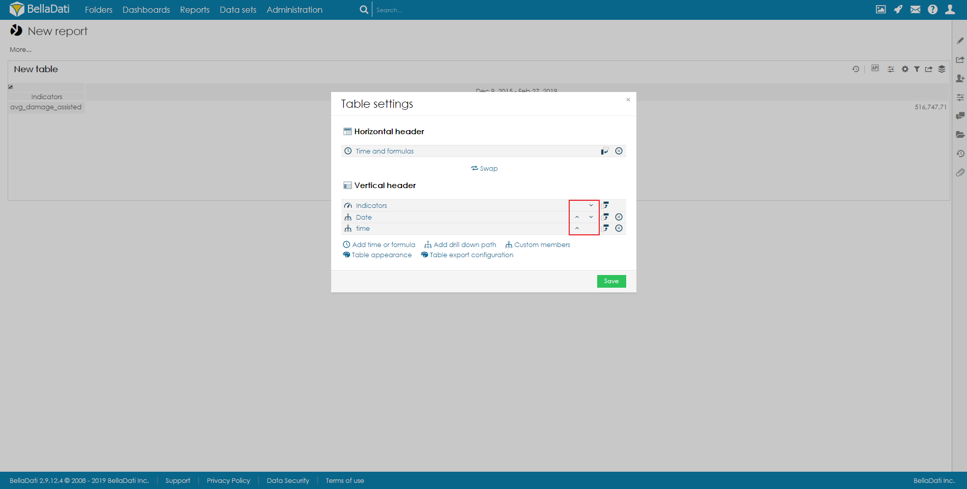
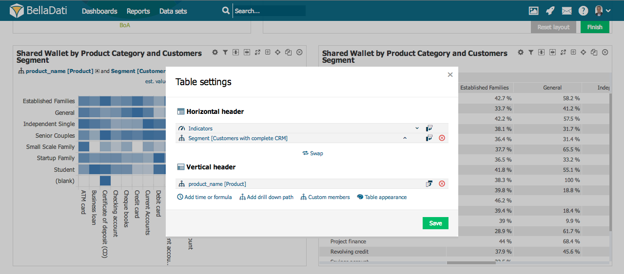
  • Table settings
  • Indicators
  • Table appearance
  • Filter setting - continue by Static Filters
  • Export view - available in view mode only, continue by Exporting View
  • Add to dashboard - available in view mode only
  • Duplicate table
  • Delete table
Tip

Hover over Indicators in a toolbox list to quickly add or remove indicators.


Table settings

Click on toolbox icon or select Table settings from the toolbox list to enter Table settings dialog.

Table settings dialog shows Time, Indicators and Drill down paths currently positioned at X and Y axes (horizontal and vertical header). BellaDati allows you to:
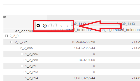
  • Swap horizontal and vertical header clicking on Swap
  • Switch between horizontal and vertical position. This allows you to move one element from the horizontal header to vertical header and vice versa.
  • Change order within axis.
  • Remove drill down path.
  • Enter indicators or drill down path dialogs.


Managing drill-downs

Hover your mouse over the drill-down header to display drill-down management box. This box allows you to:
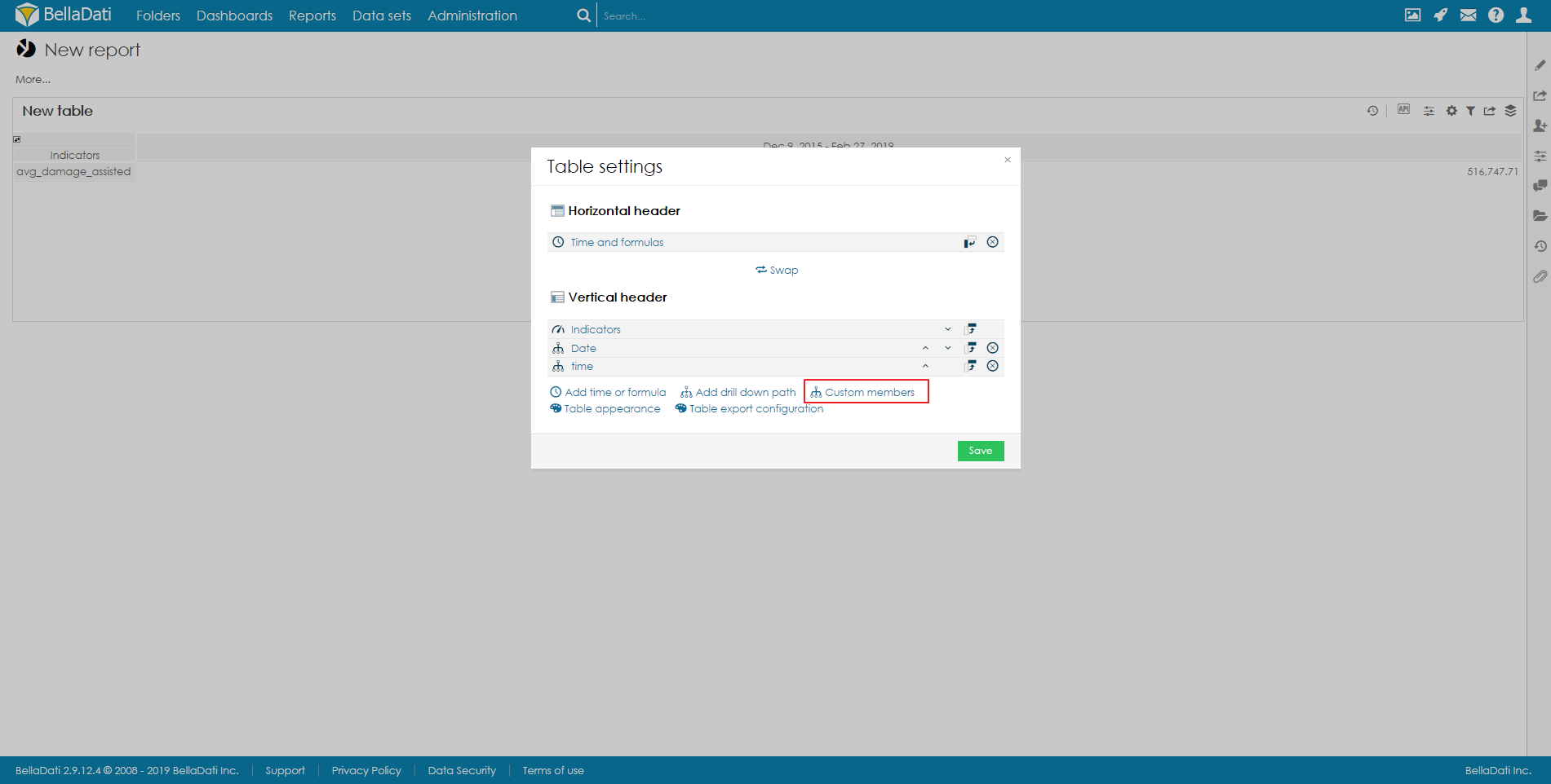
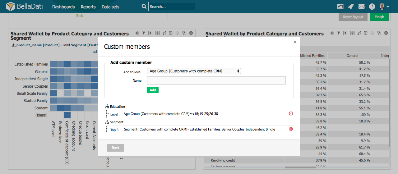
  • add new drill down to the table ("+" sign)
  • remove drill down from the table ("X" sign)
  • change position of drill-downs in the table ("<" and ">" signs)
  • expanding all drill-downs in table ("+" sign in square)
  • collapsing all drill-downs in table ("-" sign in square)

Custom member

Custom member allows you adding your own nodes into drill down paths. You can add Custom member from Table settings dialog after selecting Custom members.

Custom member dialog allows you to:

  • Select Level for a custom member.
  • Specify Name of the custom member.

Every new node requires additional definition. Custom member definition dialog allows you to determine attribute values from particular levels which will be aggregated into custom member.
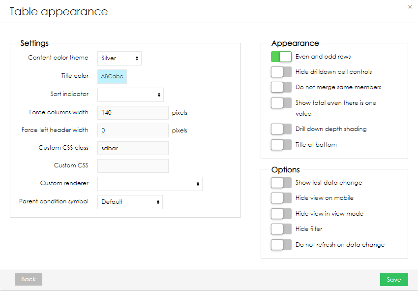
Info

You can delete created nodes in Custom member dialog.


Table Appearance

You can access Table Appearance from the Table Settings dialog or the from toolbox drop down list.

Table Appearance dialog allows:
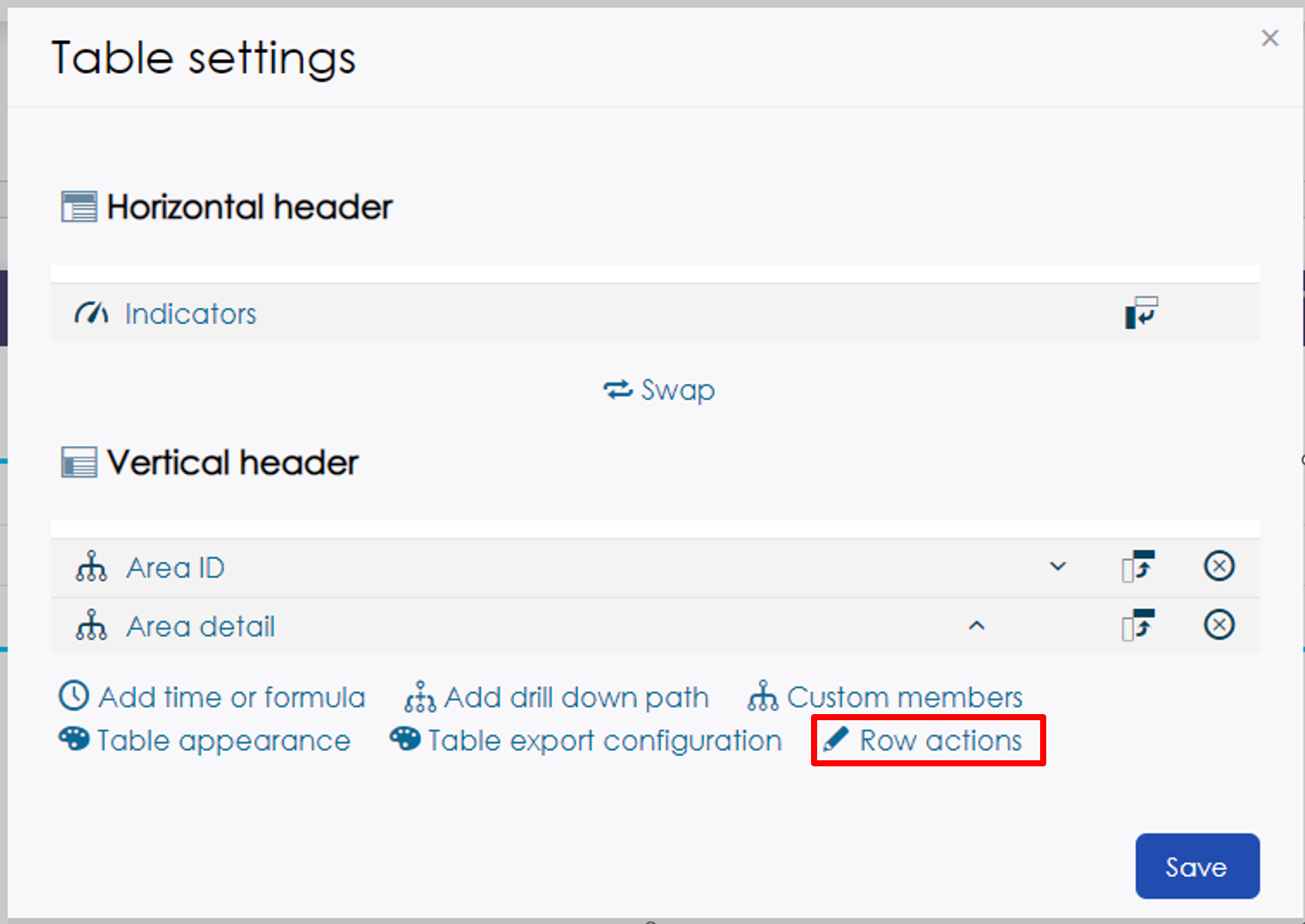
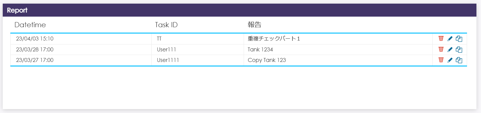
  • Applying predefined Content color themes.
  • Setting Title Color.
  • Checking Even and odd rows differentiation.
  • Hide drilldown cell controlls: Drill-down "+" signs will be disabled for all drill-downs in the table (useful for "static" item lists etc.). This will also enable sorting by drill-downs.
  • Selecting Drill down depth shading. When enabled, each drill-down level is highlighted with a different color shade.
  • Force column width sets the width of each indicator column. In case the total width of the columns exceeds the width of the screen, a scrollbar is displayed. If the table has too much space, data columns will be wider to take up the remaining space.
  • Force left header width allows the user to set the width of the whole drilll-down area when standard drill-down (not date or time) is used. When there are multiple drill-down attributes in the table, the width is applied to all of them together. In case the width of the columns exceeds the width set in the table appearance, a scrollbar is displayed.
  • Set sort indicator and its aggregation.
  • Format priority - If you are using table with formula in one axis and indicators on second axis, you can specify which of them will have priority with output format. Formatted row/column has priority over non formatted. If two formatted axis collide. This settings will set priority.
  • Simple table - selecting this option will display table with pagination. Number of records displayed on one page can be defined in the parameter Limit
  • Column Filters - If you are using simple tables, you can enable Column Filters. Standard Static filters are used here. You can also filter on indicators, that are using formulas. See Formula datatype under Displaying indicators.
  • Hide filter function will hide static and view filters.
  • Hide static filters function will hide static filters in view.
  • Min/Max height - If adaptive layout is turned on, you can define minimal and maximal height of view.
  • Show filter button - When "Hide controls" in report appearance is used Show filter button is also enabled, filter button will always be visible.
  • Prevent to Do not refresh on data change. When this is activated, page must be refreshed first to apply this change.
  • Move your view Title at bottom of the view.
  • You can remove empty rows after table is rendered. If you are using formulas, they should return NaN. This is best to use with Do not merge same members. Removing empty rows is done after table is rendered. It may take a second.
  • Using Custom renderer which is defined in a BellaDati extension (available since BellaDati 2.9.4). See Using Custom Table Renderer for more details.
  • View display formula - using formula, that will return true or false will determine, if view will be displayed.
  • Show empty view - even if dataset does not have any data in it, this option will allow to display selected view
Tip

Hover over Table Appearance in toolbox list to quickly apply Title Color.


Row actions

Actions can be set for each row displayed in the table:
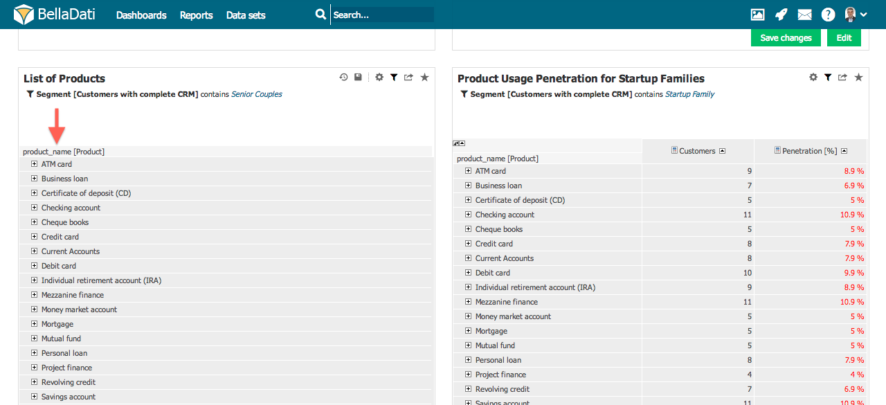
  • Row identifier - The data that matches the columns specified here will be the target of the action
  • Delete row action - Deletes the data in the row where the bin icon is clicked from the data set
  • Delete callback - If delete is confirmed, selected endpoint will be called
  • Delete header - Sets header of modal when delete icon is pressed
  • Edit row action - The data in the row for which the edit icon clicks can be edited from a previously created form
    • Edit form - Select form that will pop-up when edit button is pressed
  • Copy row action -  The data in the row for which the copy icon clicks can be copied from a previously created form
    • Do not copy columns - You can select what columns will not be copied
    • Copy form - Select form that will pop-up when copy button is pressed
  • Custom buttons - Any endpoint can be selected, that will be called. Simple POST is done on a specified endpoint
  • Popup header - The header text of the displayed pop-up can be specified
  • Popup width - The width of the displayed pop-up can be specified]


Info

Every text values can be also translated


Displaying Source Data

See how it works.

Static Lists

BellaDati allows you to list attribute members without any indicators in form of a static lists. In order to create static lists:

  1. Create new Table
  2. Select arbitrary Indicator.
  3. Choose desired Attributes.
  4. Remove Indicator from the table.
  5. Optionally hide drill-down controlls in Table Appearance.
  6. Optionally prevent BellaDati from merging same members in Table Appearance.


Setup export layout

To see how setup your own export layout (custom row height, column width, table header, data formatting or merged regions), proceed to separate page.


...

Sv translation
languageja


Note

新しい表を作成するには、編集モードにする必要があります。上部のレポートメニューで[編集]をクリックし、 編集モードを有効にします。

新しいを追加するには、空き場所(『ここをクリックする。ビューを作成する。』と表示されるエリア)にカーソルを合わせて、ビュータイプをクリックします。[表を追加する]ダイアログボックスが表示されます。

  1. 新しい表の名前を入力します。
  2. 表示されるデータの期間を制限する必要がある場合は、期間指定をチェックします - Setting Date Intervalに進みます。

緑色の[次へ]ボタンをクリックして、新しいビューを確認します。 BellaDatiが追加のセットアップをガイドします。

  • インジケータ: 表に表示されているインジケータを選択して編集します – Displaying Indicatorsに進みます。
Tip

インジケータなしで表を作成することもできます。これは「静的」アイテムリストレポートに役立ちます(特に、より多くのドリルダウンと非表示のドリルダウン「+」記号と組み合わせて)。

表の管理

挿入されたビューの右上隅で、追加の操作を実行できます:

  • 表設定
  • インジケータ
  • 表の外観
  • フィルター設定 - Static Filtersに進みます。
  • ビューのエクスポート - 表示モードでのみ利用可能です。Exporting Viewに進みます。
  • ダッシュボードに追加 - 表示モードでのみ利用可能です。
  • 表の複製
  • 表の削除

Tip

ツールボックスリストのインジケータの上にカーソルを合わせて、インジケータをすばやく追加・削除可能です。


表設定

ツールボックスアイコンをクリック、またはツールボックスリストから表設定を選択し、表設定ダイアログを入力します。

表設定ダイアログには、現在X軸とY軸(水平ヘッダーと垂直ヘッダー)に配置されている時間インジケータドリルダウンパスが表示されます。BellaDatiでは以下のことが可能です:

  • [交換する]をクリックして一気にX軸とY軸を入れ替えます
  • X軸とY軸を切り替えます(^ボタンと×ボタンの間にある矢印ボタン)。これにより、同じ軸内に複数の要素を配置している場合でも、そのうちの1つの要素をX軸からY軸に、またはその逆に移動できます。
  • 軸内の順序を変更します(^ボタン)

  • ドリルダウンパスを削除します

  • インジケータやドリルダウンパスダイアログを入力します

  • Editing Table Axes Content
  • カスタムメンバーを追加します
  • 表の外観を編集します

ドリルダウンの管理

ドリルダウンヘッダーの上にカーソルを合わせて、ドリルダウン管理ボックスを表示します。このボックスでは以下のことが可能です:

  • テーブルに新しいドリルダウンを追加します ("+" 記号)
  • テーブルからドリルダウンを削除します ("X" 記号)
  • テーブル内のドリルダウンの位置を変更します ("<" および ">" 記号)
  • テーブル内のすべてのドリルダウンを展開します ("+" 記号を四角で囲む)
  • テーブル内のすべてのドリルダウンを折りたたみます ("-" 記号を四角で囲む)


カスタムメンバー

カスタムメンバーを使用すると、独自のノードをドリルダウンパスに追加できます。 [カスタムメンバーの追加]を選択した後、[表設定]ダイアログからカスタムメンバーを追加できます。

カスタムメンバーダイアログで行えることは:

  • カスタムメンバーのレベルを選択します。
  • カスタムメンバーの名前を指定します。

新しいノードごとに追加の定義が必要です。カスタムメンバー定義ダイアログでは、カスタムメンバーに集約される特定のレベルから属性値を決定できます。

Info

カスタムメンバーダイアログで作成したノードを削除できます。


表の外観

[表設定]ダイアログまたはツールボックスのドロップダウンリストから、表の外観にアクセスできます。

表の外観ダイアログでは、以下のことができます:

  • 定義済みのコンテンツカラーテーマを適用します。

  • タイトルの色設定します。
  • 偶数行・奇数行の区別を確認します。
  • ドリルダウンセルコントロールを非表示: 表内のすべてのドリルダウンにおいて、ドリルダウン「+」記号が無効になります(「静的」アイテムリストなどに役立ちます)。
  • 奥行きの色付け深堀する(ドリルダウンの色付け)を選択します。有効にすると、各ドリルダウンレベルが異なる色合いで強調表示されます。
  • 列幅を固定すると、各インジケータ列の幅が設定されます。列の合計幅が画面の幅を超える場合、スクロールバーが表示されます。表のスペースが多すぎる場合、データ列が広くなり、残りのスペースを占有します。
  • 左ヘッダー幅を固定することにより、ユーザーは標準のドリルダウン(日付または時刻ではない)が使用される時に、ドリルダウン領域全体の幅を設定できます。表に複数のドリルダウン属性がある場合、幅はそれらすべてにまとめて適用されます。列の幅が表の外観で設定された幅を超える場合、スクロールバーが表示されます。
  • インジケータ順の並べ替え集計を設定します。
  • フォーマットの優先順位 - 1つの軸に数式、2つ目の軸に指標を持つテーブルを使用している場合、出力フォーマットでどちらを優先するかを指定することができます。フォーマットされた行/列は、フォーマットされていない行/列よりも優先されます。2つのフォーマットされた軸が衝突する場合。この設定により、優先順位が設定されます。
  • シンプルなテーブル - このオプションを選択すると、テーブルがページネーションで表示されます。1ページに表示されるレコードの数は、Limitパラメータで定義できます。
  • 列フィルター - シンプルなテーブルを使用している場合、列フィルターを有効にすることができます。ここでは標準の静的フィルターが使用されます。また、式を使用しているインジケーターにフィルターをかけることもできます。インジケーターの表示方法の下にある「式のデータタイプ」を参照してください。
  • Hide filter機能は、静的フィルタを非表示にします。ビューフィルタは表示されたままです。
  • 静的フィルタの非表示機能は、静的フィルタを非表示にする機能です。
  • フィルターボタンの表示 - レポートの外観で「コントロールを隠す」を使用している場合、「フィルターボタンの表示」を有効にすると、フィルターボタンは常に表示されます。
  • データ変更時に更新しないに設定します。これを有効にすると、この変更を適用するためには、まずページを更新する必要があります。
  • ビューのタイトルをビューの下部に移動します。
  • テーブルがレンダリングされた後、空の行を削除することができます。数式を使用している場合は、NaN を返す必要があります。これは、Do not merge same members と一緒に使用するのが最適です。空の行の削除は、テーブルがレンダリングされた後に実行され、適応には1 秒ほどかかります。
  • BellaDati拡張機能で定義されているカスタムレンダラーの使用(BellaDati 2.9.4以降で使用可能)。詳細については、Using Custom Table Rendererを参照してください。
  • ビューの表示式 - 式を使用して、true または false を返すことで、ビューが表示されるかどうかを決定します。
  • 空のビューを表示 - データセットにデータがなくても、このオプションを使用して選択したビューを表示できます。
Tip

ツールボックスリストの表の外観にカーソルを合わせて、タイトルの色をすばやく適用します。


テーブルの外観

行のアクション

テーブルに表示されている各行に対して、アクションを設定することができます:

  • 行識別子 - ここで指定された列と一致するデータがアクションの対象となります。
  • 行削除アクション - 削除アイコンをクリックした行のデータをデータセットから削除します。
  • 行編集アクション - 編集アイコンをクリックした行のデータを、作成済みのフォームから編集することができます
  • 行をコピーする操作 - コピーアイコンをクリックした行のデータを、以前に作成したフォームからコピーすることができます。
    • 列をコピーしない - コピーしない列を選択することができます。
  • カスタムボタン - 任意のエンドポイントを選択することができ、それが呼び出されます。指定したエンドポイントに単純なPOSTが行われます。
  • ポップアップヘッダー - 表示されるポップアップのヘッダーテキストを指定することができる
  • ポップアップの幅 - 表示されるポップアップの幅を指定できます。

ソースデータの表示

仕組みはこちらをご覧ください。

静的リスト

BellaDatiを使用すると、静的リストの形式でインジケータなしで属性メンバーをリストできます。静的リストを作成するには:

  1. 新しいを作成します。
  2. 任意のインジケータを選択します。
  3. 目的の属性を選択します。

  4. 表からインジケータを削除します。

  5. オプションで、表の外観でドリルダウンセルコントロールを非表示にします。
  6. オプションで、表の外観でBellaDatiが同じメンバーをマージするのを防ぎます。


エクスポートレイアウトの設定

独自のエクスポートレイアウトの設定方法(カスタム行の高さ、列幅、テーブルヘッダー、データの書式設定、結合領域)を確認するには、Setting table export configurationに進みます。


...