Page History
| Sv translation | ||||||||||||||||
|---|---|---|---|---|---|---|---|---|---|---|---|---|---|---|---|---|
| ||||||||||||||||
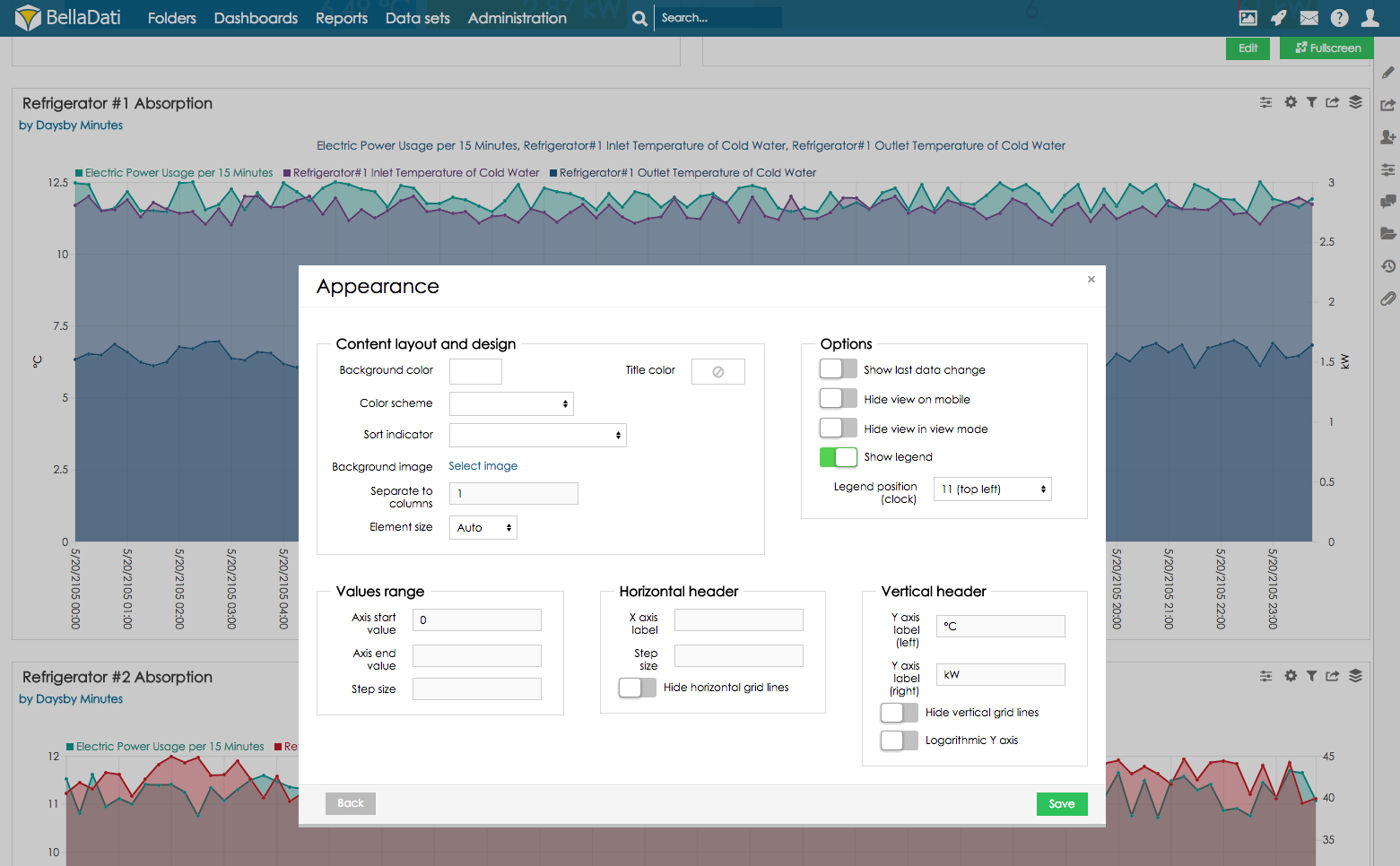
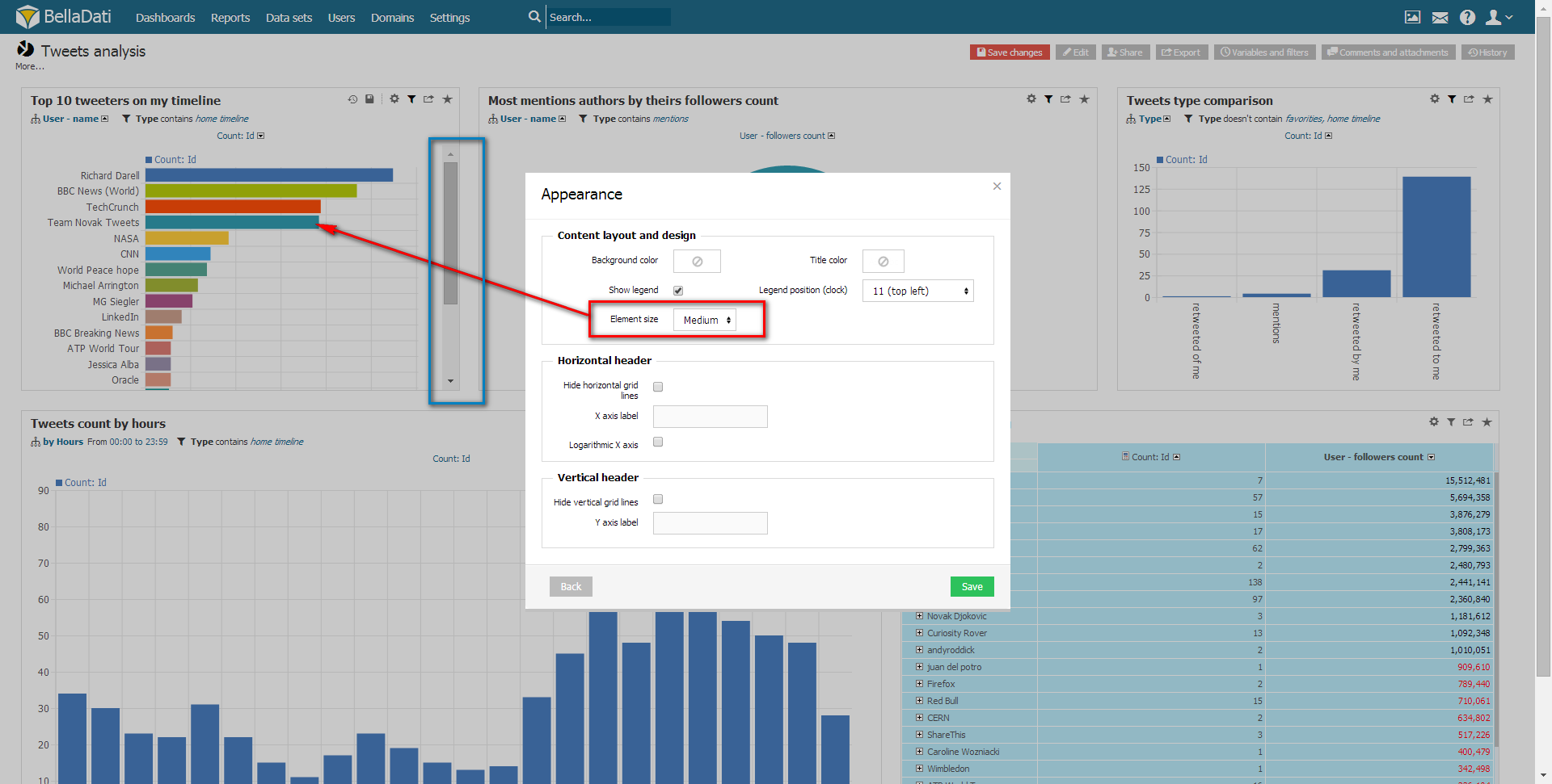
Chart appearanceYou can edit Chart appearance from Table settings dialog after selecting Chart appearance or directly from the toolbox list.
Appearance dialog allows you to:
|
| Note |
|---|
These changes will affect all views and reports based on this data set. You must have editiong permissions to perform such changes. |
See Members appearance and Attributes and members translation for more details.
Related content | |||||
|---|---|---|---|---|---|
|
...
| Sv translation | |||||||||
|---|---|---|---|---|---|---|---|---|---|
| |||||||||
チャートの外観[チャートの外観]を選択した後、または[ツールボックス]リストから直接選択後、[テーブル設定]ダイアログからチャートの外観を編集できます。
外観ダイアログでは次のことができます:
|
| Note |
|---|
これらの変更は、このデータセットに基づくすべてのビューとレポートに影響します。このような変更を行うには、編集権限が必要です。 |
詳細については、Members Appearanceと、Translating Attributes and Membersを参照してください。
...
Overview
Content Tools