In this tutorial you will obtain data from existing BellaDati chart view using Client API and create a custom visualization.
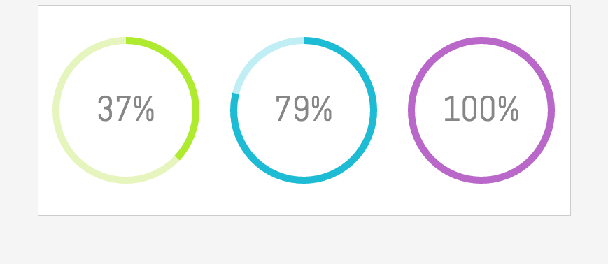
Result will look like this:
All of this will be accomplished using BellaDati Client API, JavaScript, JQuery and HTML5 canvas.
Tutorial parts:
- Working with BellaDati Extensions
- Getting data from BellaDati chart view
- Creating custom chart
Working with BellaDati Extensions
Before you start with Client API you have to learn how create BellaDati Extension.
Extensions allow you to to customize BellaDati front-end functions or create custom content like charts or dashboards.
This function is available for System administrators. Access it by going to Administration - Advanced settings - Extensions.

Extensions consist of three parts: External JavaScript libraries, code that is appended to the end of head element content and code that is appended to the beginning of body.
First give your extension a name.

Next create layout of the Extension where the custom chart will be placed:
<div id="wrapper">
<div id="view1" class="view">
<canvas id="canvas1" class="canvas" width="250" height="250"></canvas>
</div>
<div id="view2" class="view">
<canvas id="canvas2" class="canvas" width="250" height="250"></canvas>
</div>
<div id="view3" class="view">
<canvas id="canvas3" class="canvas" width="250" height="250"></canvas>
</div>
</div>
Place the code to the Beginning of the body.
Then style the layout:
<style>
body {
	background-color: #F5F5F5 ;
}

.canvas {
    display: block;
    padding-left: 0;
    padding-right: 0;
    margin-left: auto;
    margin-right: auto;
  	padding-top: 10%;
}
.view {
	display: inline-block;
}
#wrapper {
	width: 760px;
	height: 300px;
	display: block;
    padding-left: 0;
    padding-right: 0;
    margin-left: auto;
    margin-right: auto;
    background-color: #fff;
    border: 1px solid #ccc;
}
</style>
Place the code to the End of head.
Extension is now created so you can continue with the next part.
Getting data from BellaDati
This example is based on Speedometer chart. To keep it simple you will work only with one indicator value.
For this case let's assume that there is a formula indicator calculating a percentage value - so the value you get is always in 0 - 100 range.
You can download this BellaApp and upload it into BellaDati. It contains data set and report created following steps below.
- Create a data set with three indicators and insert a value between 0 - 100 using browse data.
- In the next step create a report based on previously created data set.
- Insert 3 views and to each add a Speedometer chart with previously created indicator.
Everything is now ready so you can start with getting the data from the chart view.
User has to have access permission to the source report. Otherwise the data from the chart cannot be obtained.
Click on the view from which you want to get a value with right mouse button and select "Inspect".

You can find the view's ID in the element of this view. It looks like "8313-0dt2jiMsXY" with "8313" being ID of the report and "0dt2jiMsXY" being ID of the view.

Now to loading the data.
Create a function with Ajax call to get data from the chart using the viewDetail endpoint so it can be later used for rendering a chart. See http://support.belladati.com/techdoc/Report+API for all Report API endpoints.
function loadData() {

			$.ajax({
	                    url: "/bi/report/api:viewDetail/reportID-viewID",	// for example "/bi/report/api:viewDetail/8306-Ua0dyvh7lc"
	                    success: function(chartReply) {
	                      var value = chartReply.data.elements[0].values[0].value; // assign the value from the chart to variable
	                      console.log(value);	// check if the code above is correct
	                    }
	                  });
		}
	loadData();
Chart data are returned in a JSON and the indicator value can be accessed using this path:
var value = chartReply.data.elements[0].values[0].value;
Check in the JavaScript console if your code is correct and you can see the value of the indicator from the chart.

Creating custom chart
Now that you have the value you can start building a chart.
In this example is a simple gauge created using HTML5 canvas.
In this custom chart the value you get from a chart is used to calculate radius of the gauge that will be filled and is also displayed as a percentual value inside of the gauge.
The value is rounded to the nearest integer to make it more clean in this example.
createGauge function that creates the chart has 4 parameters. ID of the canvas element in your Extension, ID of the chart view in BellaDati, color of the Guage background and color of the space that is filled.
function createGauge(canvasID, viewID, color, bgcolor)
	{
		//canvas initialization
		var canvas = document.getElementById(canvasID);
		var ctx = canvas.getContext("2d");
		//dimensions
		var W = canvas.width;
		var H = canvas.height;
		//Variables
		var chartData;
		var degrees = 0;
		var new_degrees = 0;
		var difference = 0;
		var text;
		var animation_loop;

		//previsouly created function to load the value
		function loadData() {
			$.ajax({
	                    url: "/bi/report/api:viewDetail/" + viewID,
	                    success: function(chartReply) {
	                      var value = chartReply.data.elements[0].values[0].value;
	                      chartData = Math.round(value*3.6);	//transform the value to degrees and round it
	                      draw();
	                    }
	                  });
					}
		loadData();

		function init()
		{
			//Clear the canvas everytime a chart is drawn
			ctx.clearRect(0, 0, W, H);

			//Background 360 degree arc
			ctx.beginPath();
			ctx.strokeStyle = bgcolor;	// color of the background
			ctx.lineWidth = 10;
			ctx.arc(W/2, H/2, 100, 0, Math.PI*2, false);
			ctx.stroke();

			//gauge will be a simple arc
			//Angle in radians = angle in degrees * PI / 180
			var radians = degrees * Math.PI / 180;
			ctx.beginPath();
			ctx.strokeStyle = color;	//color of the filled space
			ctx.lineWidth = 10;
			//The arc starts from the rightmost end. If we deduct 90 degrees from the angles
			//the arc will start from the topmost end
			ctx.arc(W/2, H/2, 100, 0 - 90*Math.PI/180, radians - 90*Math.PI/180, false);
			//you can see the arc now
			ctx.stroke();

			//Lets add the text
			ctx.fillStyle = "#868686";	//color of the text
			ctx.font = "50px Abel";
			text = Math.round(degrees/360*100) + "%";
			//center the text
			//deducting half of text width from position x
			text_width = ctx.measureText(text).width;
			//adding manual value to position y
			ctx.fillText(text, W/2 - text_width/2, H/2 + 15);
		}

		function draw()
		{
			//Cancel any movement animation if a new chart is requested
			if(typeof animation_loop != undefined) clearInterval(animation_loop);

			//get degrees that could be filled
			new_degrees = chartData;
			difference = new_degrees - degrees;
			//This will animate the gauge to new position
			//The animation will take 1 second
			//time for each frame is 1sec / difference in degrees
			animation_loop = setInterval(animate_to, 1000/difference);
		}

		//function to make the chart move to new degrees
		function animate_to()
		{
			//clear animation loop if degrees reaches to new_degrees
			if(degrees == new_degrees || new_degrees === undefined)
				clearInterval(animation_loop);

			if(degrees < new_degrees)
				degrees++;

			init();
		}
	}
Create gauges in canvas elements using these parameters:
function renderGauges()
		{
		 createGauge("canvas1", "viewId1", "#AEEA2E", "#E6F5BE"); // e.g.: createGauge("canvas1", "8306-k1LELScByj", "#AEEA2E", "#E6F5BE");
		 createGauge("canvas2", "viewId2", "#1EBBD4", "#C1EEF4"); // make sure you are using correct ID of the view
		 createGauge("canvas3", "viewId3", "#B967C9", "#EED9F0");
		}
		renderGauges();
As the last step add font that is used inside of the gauge:
<link href='https://fonts.googleapis.com/css?family=Abel' rel='stylesheet' type='text/css'>
Place the code to the End of head.
You have created a view with multiple charts displaying live data from BellaDati. This view can be used for example in custom reports or dashboards.
Complete code is available here - End of Head + Beginning of body.
Overview
Content Tools