In BellaDati it is possible to change the appearance of almost any elemtent on the screen. This example will show you how to change appearance of filter components. At the end basic radio buttons will be transformed into clickable buttons. Knowledge of HTML and CSS is required.
Preparation
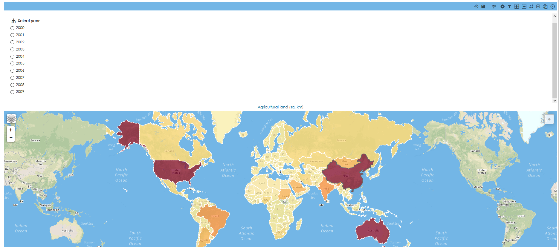
Create a report which will contain a filter with radio button component. In this example a filter inside view is used but similiar approach can be used for other types of filters. By default it will look something like this:
Custom CSS
It is possible to add custom CSS by using look and feel settings of your domain or by adding the code to a custom content. In this case custom content will be used since we want to apply the changes only on one report.
All changes have to be done in Source mode. Otherwise the code won't work.
- Add new custom content to your report.
- Switch to Source mode.
Hide radio buttons and aligned all options in one row:
 <style>
input[type="radio"],
input[type="checkbox"] {
    /* hide the inputs */
    opacity: 0;
}
.no-slider form div p {
  display:inline-block;
}
.no-slider form div {
	max-width:900px !important;
	border:0px !important;
	padding-bottom: 0px !important;
    margin-top: 0px !important;
    padding-top: 0px !important;
}
.no-slider {
	overflow:unset !important;
}
</style>
Add style to labels which will work as buttons:
/* style your lables/button */
input[type="radio"] + label,
input[type="checkbox"] + label {
    /* keep pointer so that you get the little hand showing when you are on a button */
    cursor: pointer;
    /* the following are the styles */
    padding: 4px 10px;
    border: 1px solid #FF8254;
    background: #FF8254;
    color: #fff;
    width: 40px;
	display: block;
	margin-left: 10px;
	text-align: center;
	font-size: 15px;
	text-rendering: unset;
	text-rendering: optimizelegibility !important;
}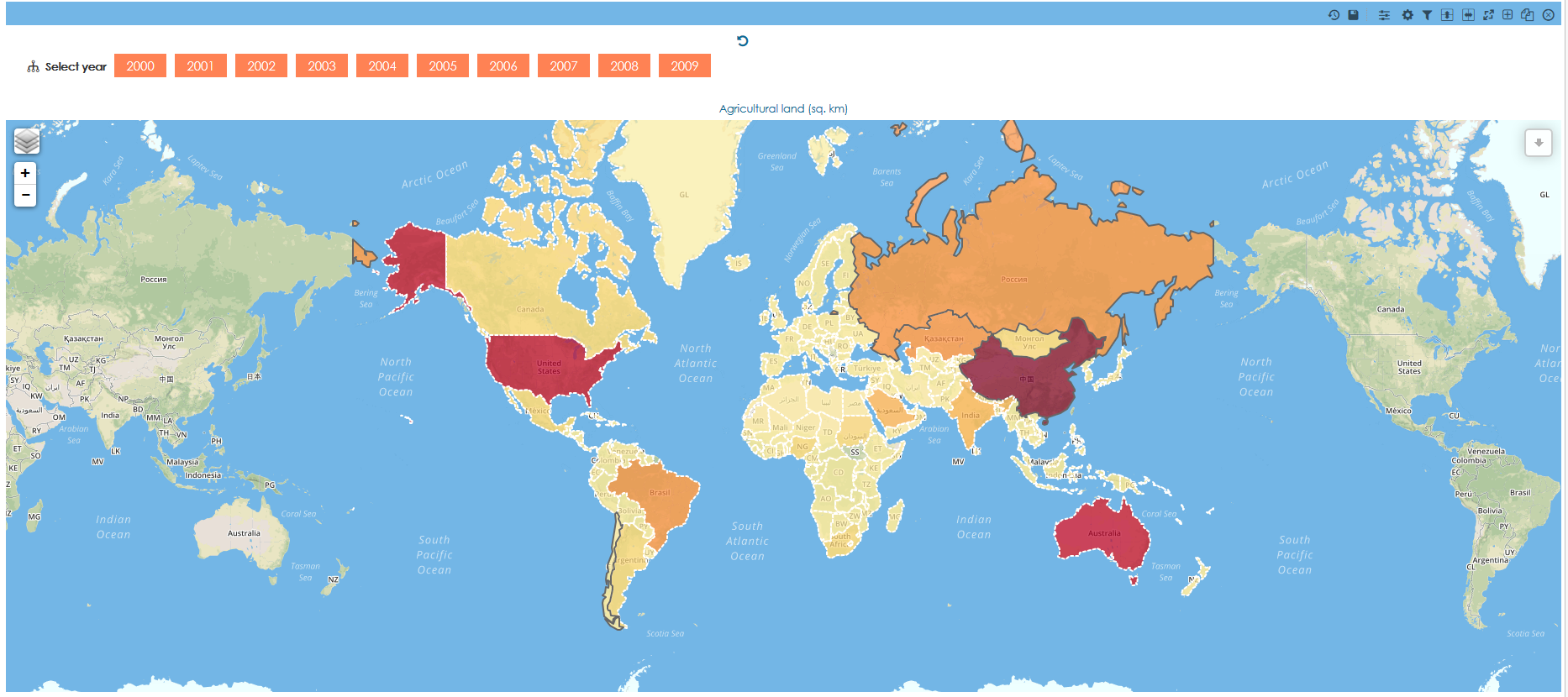
You can also add advanced style options such as shadows, rounded corners or transitions:
box-shadow: 1px 2px 4px #888888;
transition: all 0.6s ease 0s;
text-shadow: 1px 1px 1px rgba(200, 200, 200, 0.5);
text-rendering: optimizelegibility !important;
border-radius: 3px;

Add different style for selected and hovered item:
input[type="radio"]:hover + label,
input[type="checkbox"]:hover + label {
    border: 1px solid #DE594B;
    background: #DE594B;
}
input[type="radio"]:checked+ label,
input[type="checkbox"]:checked+ label{
    /* style for the checked/selected state */
    background: #ECC34D;
    border: 1px solid #ECC34D;
    color: white;
}
Now you have fully working buttons. Of course it is possible to further change the appearance of the report. In this example we will change the background to be the same as the map and we will also hide the name of filter.
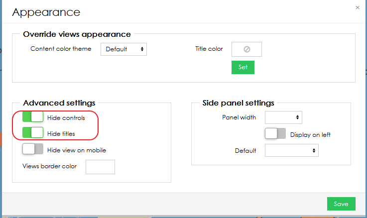
#contentNarrower, .textViewContainer,.leaflet-container { background-color: #73B6E6!important; } .viewContentInnerLayout { background-color: #73B6E6 !important; } .t-bdlayout-space { border: 1px solid #73B6E6 !important; }- Finally to have a clean look we will hide all report controls and top bars in Report appearance settings.
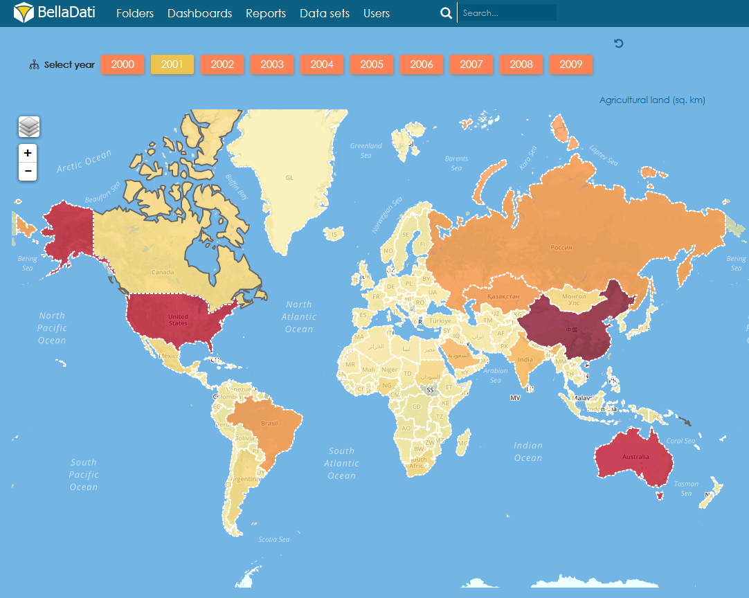
- This is the final result:
Complete CSS code:
<style> input[type="radio"], input[type="checkbox"] { /* hide the inputs */ opacity: 0; } .no-slider form div p { display:inline-block; } .no-slider form div { max-width:900px !important; border:0px !important; padding-bottom: 0px !important; margin-top: 0px !important; padding-top: 0px !important; } .no-slider { overflow:unset !important; } /* style your labels/button */ input[type="radio"] + label, input[type="checkbox"] + label { /* keep pointer so that you get the little hand showing when you are on a button */ cursor: pointer; /* the following are the styles */ padding: 4px 10px; border: 1px solid #FF8254; background: #FF8254; color: #fff; width: 40px; display: block; margin-left: 10px; text-align: center; font-size: 15px; text-rendering: unset; box-shadow: 1px 2px 4px #888888; transition: all 0.6s ease 0s; text-shadow: 1px 1px 1px rgba(200, 200, 200, 0.5); text-rendering: optimizelegibility !important; border-radius: 3px; } input[type="radio"]:hover + label, input[type="checkbox"]:hover + label { border: 1px solid #DE594B; background: #DE594B; } input[type="radio"]:checked+ label, input[type="checkbox"]:checked+ label{ /* style for the checked/selected state */ background: #ECC34D; border: 1px solid #ECC34D; color: white; } #contentNarrower, .textViewContainer,.leaflet-container { background-color: #73B6E6!important; } .viewContentInnerLayout { background-color: #73B6E6 !important; } .t-bdlayout-space { border: 1px solid #73B6E6 !important; } </style>- You can find the final report and other examples of filter in attached BellaApp.
Overview
Content Tools