You need to be in edit mode in order to create new table. Click on "Edit" in top report menu to activate edit mode.
To add a new Table, hover over free place and click on Table view type. The Add a table dialog box will appear.
- Enter name of the new table.
- Check Date interval if you need to restrict time period of displayed data - continue by Setting Date Interval .
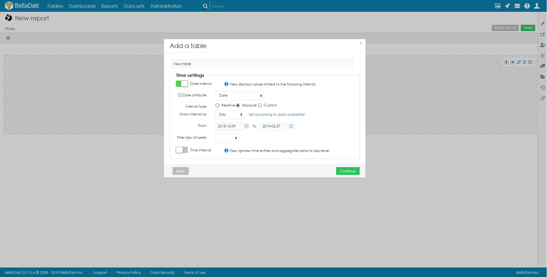
Confirm new Table view by clicking on a green Continue button. BellaDati will guide you through additional setup.
- Indicators: select and edit displayed indicators in the table - continue by Displaying Indicators .
You can create also table without any indicators. This is useful for "static"
items lists reports (especially in conjunction with more drill-downs and hiding drill-down "+" signs).
Table management
You can perform additional operations in the upper right corner of the inserted Table view:
- Table settings
- Indicators
- Table appearance
- Filter setting - continue by Static Filters
- Export view - available in view mode only, continue by Exporting View
- Add to dashboard - available in view mode only
- Duplicate table
- Delete table
Hover over Indicators in a toolbox list to quickly add or remove indicators.
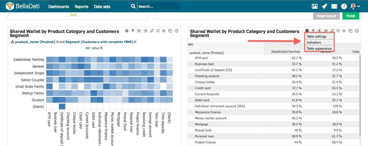
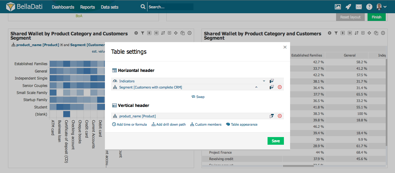
Table settings
Click on toolbox icon or select Table settings from the toolbox list to enter Table settings dialog.
Table settings dialog shows Time, Indicators and Drill down paths currently positioned at X and Y axes (horizontal and vertical header). BellaDati allows you to:
- Swap horizontal and vertical header clicking on Swap
- Switch between horizontal and vertical position. This allows you to move one element from the horizontal header to vertical header and vice versa.
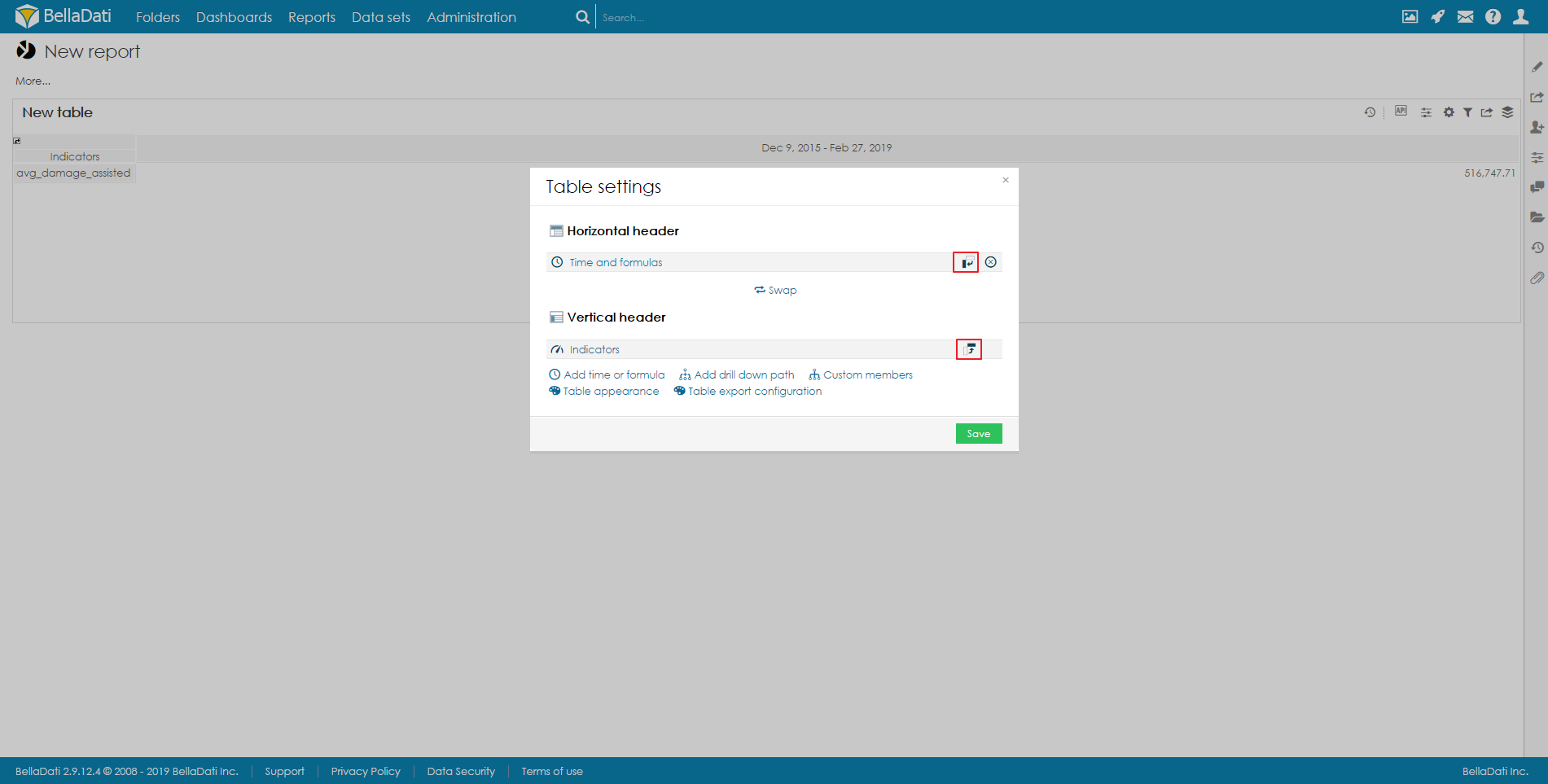
- Change order within axis.
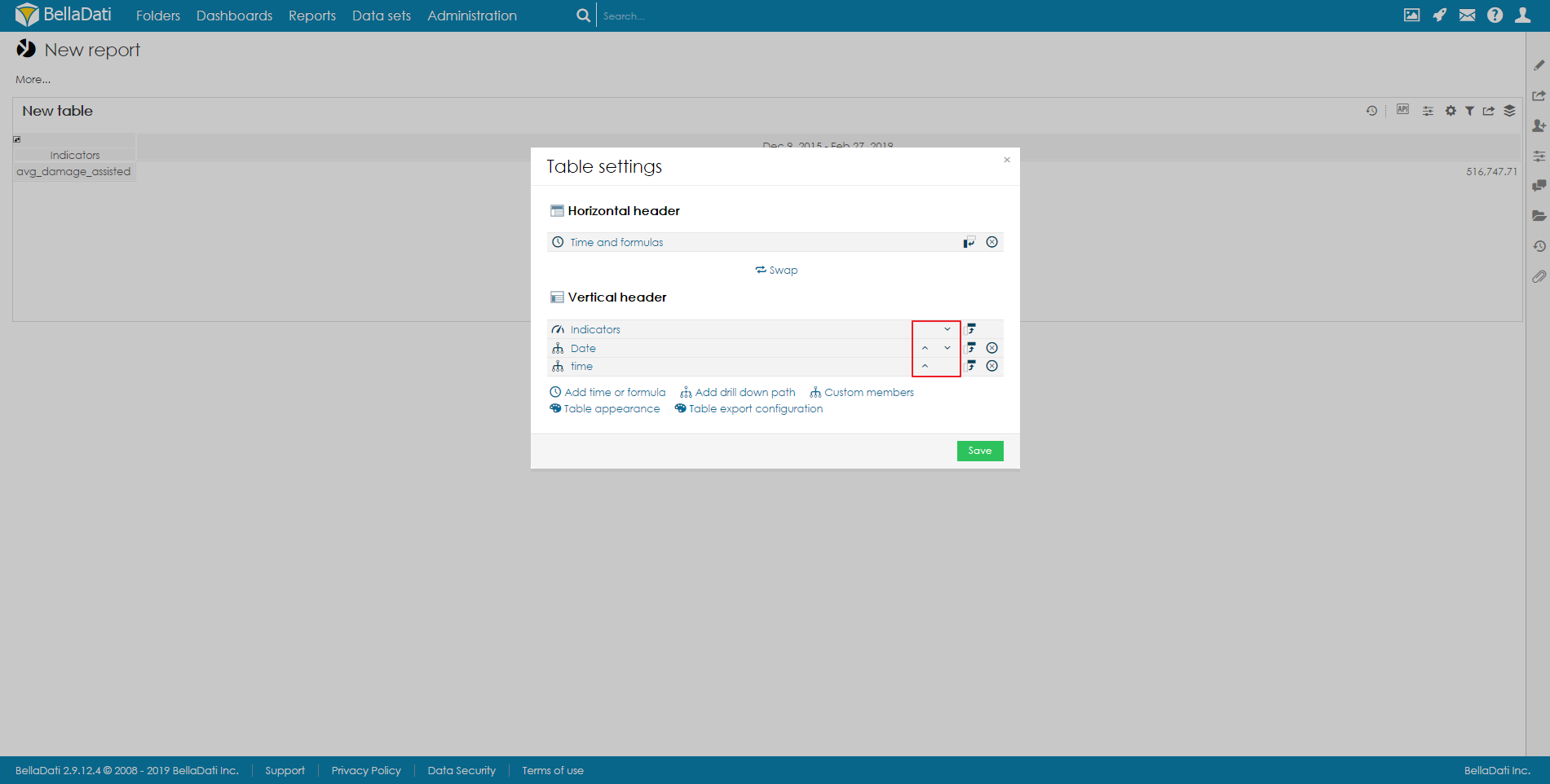
- Remove drill down path.
- Enter indicators or drill down path dialogs.
- Editing Table Axes Content
- Add custom members
- Edit table appearance.
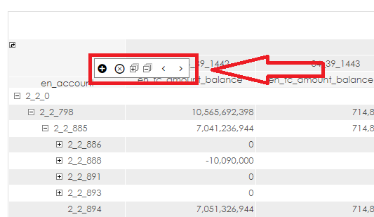
Managing drill-downs
Hover your mouse over the drill-down header to display drill-down management box. This box allows you to:
- add new drill down to the table ("+" sign)
- remove drill down from the table ("X" sign)
- change position of drill-downs in the table ("<" and ">" signs)
- expanding all drill-downs in table ("+" sign in square)
- collapsing all drill-downs in table ("-" sign in square)
Custom member
Custom member allows you adding your own nodes into drill down paths. You can add Custom member from Table settings dialog after selecting Custom members.
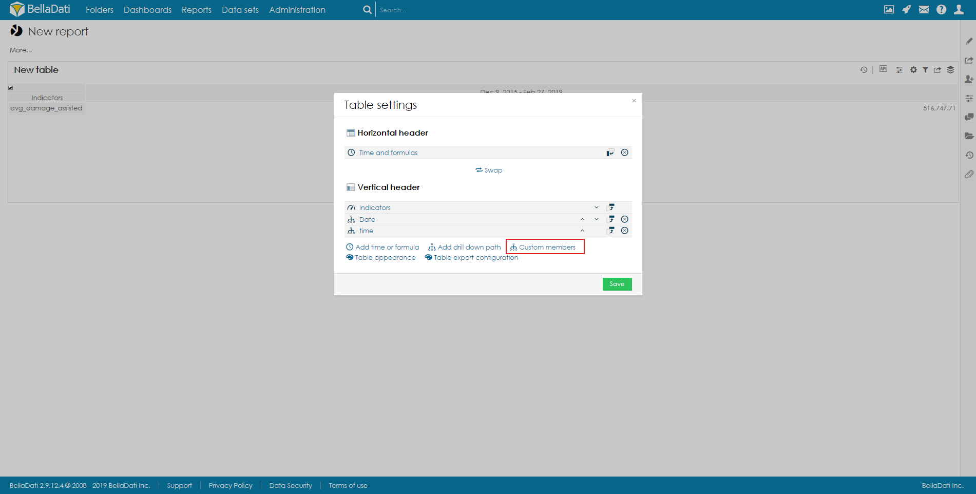
Custom member dialog allows you to:
- Select Level for a custom member.
- Specify Name of the custom member.
Every new node requires additional definition. Custom member definition dialog allows you to determine attribute values from particular levels which will be aggregated into custom member.
You can delete created nodes in Custom member dialog.
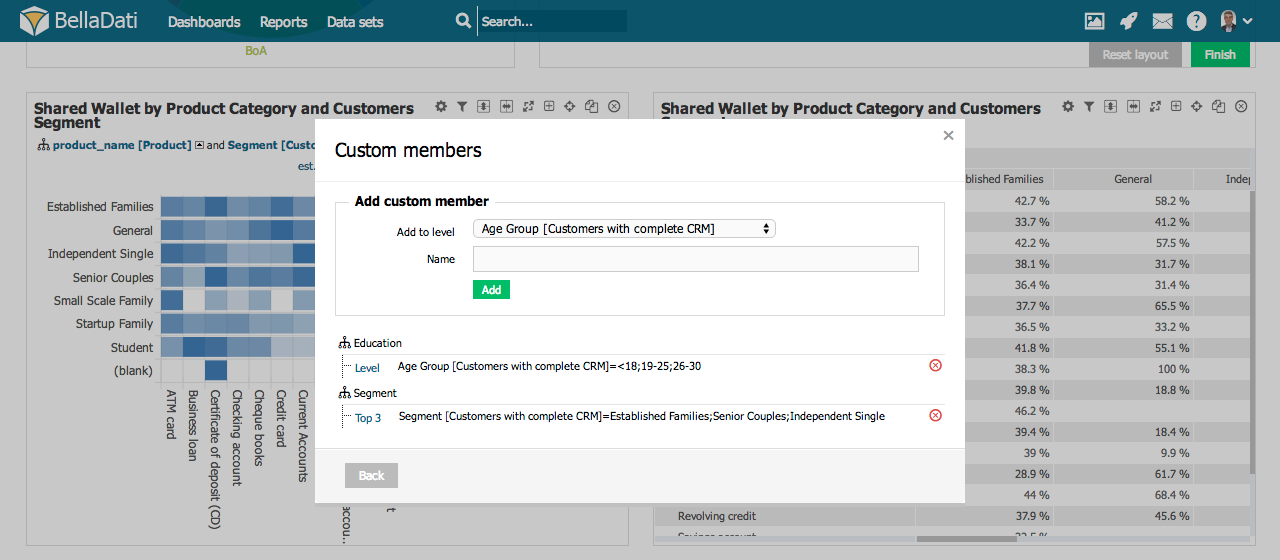
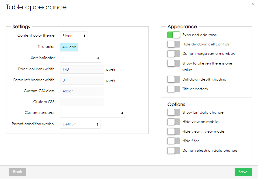
Table Appearance
You can access Table Appearance from the Table Settings dialog or the from toolbox drop down list.
Table Appearance dialog allows:
- Applying predefined Content color themes.
- Setting Title Color.
- Checking Even and odd rows differentiation.
- Hide drilldown cell controlls: Drill-down "+" signs will be disabled for all drill-downs in the table (useful for "static" item lists etc.).
- Selecting Drill down depth shading. When enabled, each drill-down level is highlighted with a different color shade.
- Force column width sets the width of each indicator column. In case the total width of the columns exceeds the width of the screen, a scrollbar is displayed. If the table has too much space, data columns will be wider to take up the remaining space.
- Force left header width allows the user to set the width of the whole drilll-down area when standard drill-down (not date or time) is used. When there are multiple drill-down attributes in the table, the width is applied to all of them together. In case the width of the columns exceeds the width set in the table appearance, a scrollbar is displayed.
- Set sort indicator and its aggregation.
- Format priority - If you are using table with formula in one axis and indicators on second axis, you can specify which of them will have priority with output format. Formatted row/column has priority over non formatted. If two formatted axis collide. This settings will set priority.
- Simple table - selecting this option will display table with pagination. Number of records displayed on one page can be defined in the parameter Limit
- Column Filters - If you are using simple tables, you can enable Column Filters. Standard Static filters are used here. You can also filter on indicators, that are using formulas. See Formula datatype under Displaying indicators.
- Hide filter function will hide static and view filters.
- Hide static filters function will hide static filters in view.
- Min/Max height - If adaptive layout is turned on, you can define minimal and maximal height of view.
- Show filter button - When "Hide controls" in report appearance is used Show filter button is also enabled, filter button will always be visible.
- Prevent to Do not refresh on data change. When this is activated, page must be refreshed first to apply this change.
- Move your view Title at bottom of the view.
- You can remove empty rows after table is rendered. If you are using formulas, they should return NaN. This is best to use with Do not merge same members. Removing empty rows is done after table is rendered. It may take a second.
- Using Custom renderer which is defined in a BellaDati extension (available since BellaDati 2.9.4). See Using Custom Table Renderer for more details.
- View display formula - using formula, that will return true or false will determine, if view will be displayed.
- Show empty view - even if dataset does not have any data in it, this option will allow to display selected view
Hover over Table Appearance in toolbox list to quickly apply Title Color.
Row actions
Actions can be set for each row displayed in the table:
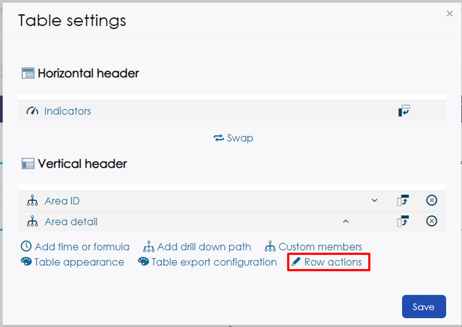
- Row identifier - The data that matches the columns specified here will be the target of the action
- Delete row action - Deletes the data in the row where the bin icon is clicked from the data set
- Delete callback - If delete is confirmed, selected endpoint will be called
- Delete header - Sets header of modal when delete icon is pressed
- Edit row action - The data in the row for which the edit icon clicks can be edited from a previously created form
- Edit form - Select form that will pop-up when edit button is pressed
- Copy row action - The data in the row for which the copy icon clicks can be copied from a previously created form
- Do not copy columns - You can select what columns will not be copied
- Copy form - Select form that will pop-up when copy button is pressed
- Custom buttons - Any endpoint can be selected, that will be called. Simple POST is done on a specified endpoint
- Popup header - The header text of the displayed pop-up can be specified
- Popup width - The width of the displayed pop-up can be specified]
Every text values can be also translated
Displaying Source Data
See how it works.
Static Lists
BellaDati allows you to list attribute members without any indicators in form of a static lists. In order to create static lists:
- Create new Table
- Select arbitrary Indicator.
- Choose desired Attributes.
- Remove Indicator from the table.
- Optionally hide drill-down controlls in Table Appearance.
- Optionally prevent BellaDati from merging same members in Table Appearance.
Setup export layout
To see how setup your own export layout (custom row height, column width, table header, data formatting or merged regions), proceed to separate page.
Next Steps | Related content |
|---|---|
${xhtml} |
Overview
Content Tools