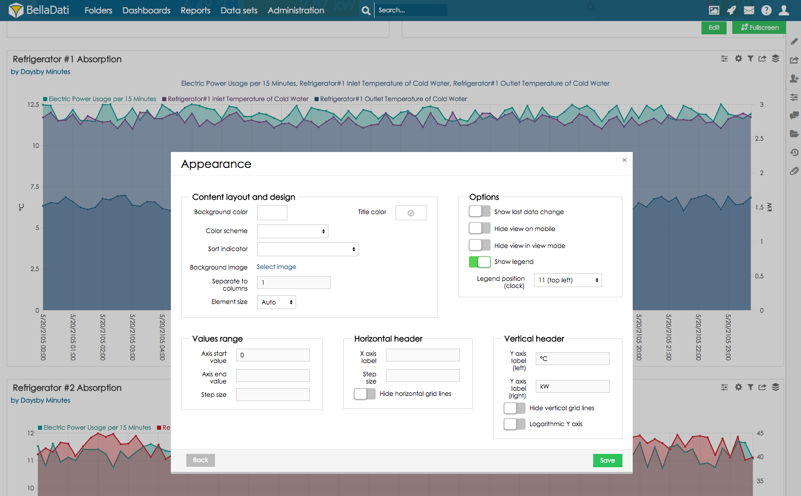
Chart appearance
You can edit Chart appearance from Table settings dialog after selecting Chart appearance or directly from the toolbox list.
Each chart type includes relevant subset of appearance options.
Appearance dialog allows you to:
- Specify Color theme and Title color
- Sort attribute allows you to order chart values by any attribute from the data set. You can choose ascending or descending order.
- Background image: Select image which will be displayed as background. You can upload new picture or select image from Media gallery.
- Separate to columns. You can specify to how many columns will be the charts displayed within the view, if there are more columns (default is one chart per row).Applicable for two or more indicators within one view.
- Value range: You can override default lower and upper limits for displaying data on Y axis. Note: Both limits must be set at the same time.
- Chart axis: Hide grid on X axis, Hide grid on Y axis
- Members on horizontal axis: Applicable if drill-down and time dimension are set together. Date/time information are displayed on X axis by standard. Use this feature to display drill-down members on X axis instead (date/time information will be distinguished by legend).
- Group values
- Show values
- Hide filter: will hide the filter conditions at the top part of the view
- Hide view in view mode: view won't be displayed to report viewers
- Define Step size (interval in which indicator plot values are displayed)
- Change Label size
- Apply Character Wrapping (labels on the X-axis will not be displayed horizontally - each character will be displayed below previous one)
- Prevent to Do not refresh on data change. When this is activated, page must be refreshed first to apply this change.
- Move your view Title at bottom of the view.
- Show empty view - even if dataset does not have any data in it, this option will allow to display selected view
- Using Custom renderer which is defined in a BellaDati extension (available since BellaDati 2.9.4). See Using Custom Chart Renderer for more details.
- Max bar width - Sets a width of all indicators bar under one drilldown with space between another drilldowns.
- Fill percentage - This feature is for Pie chart only and Fill center disabled. You can set what percentage of circle will be filled in. Using this you can create Donut chart.
Chart formula - This feature is for Pie chart only. It is used with Fill percentage. If you create donut chart, you can fill empty space inside with additional information. Use this formula:
return [text:"first line\nSecond line",color:'#FF0000',size:"30"]
- Show empty view - even if dataset does not have any data in it, this option will allow to display selected view
- Font size - Sets size of font for chart values (default 12px)
- Legend font size - Sets size of font for legend (default 12px)
- Vertical background colors - For bar chart mostly you can distinguish background color for each bar. Colors will repeat. You can use multiple colors,
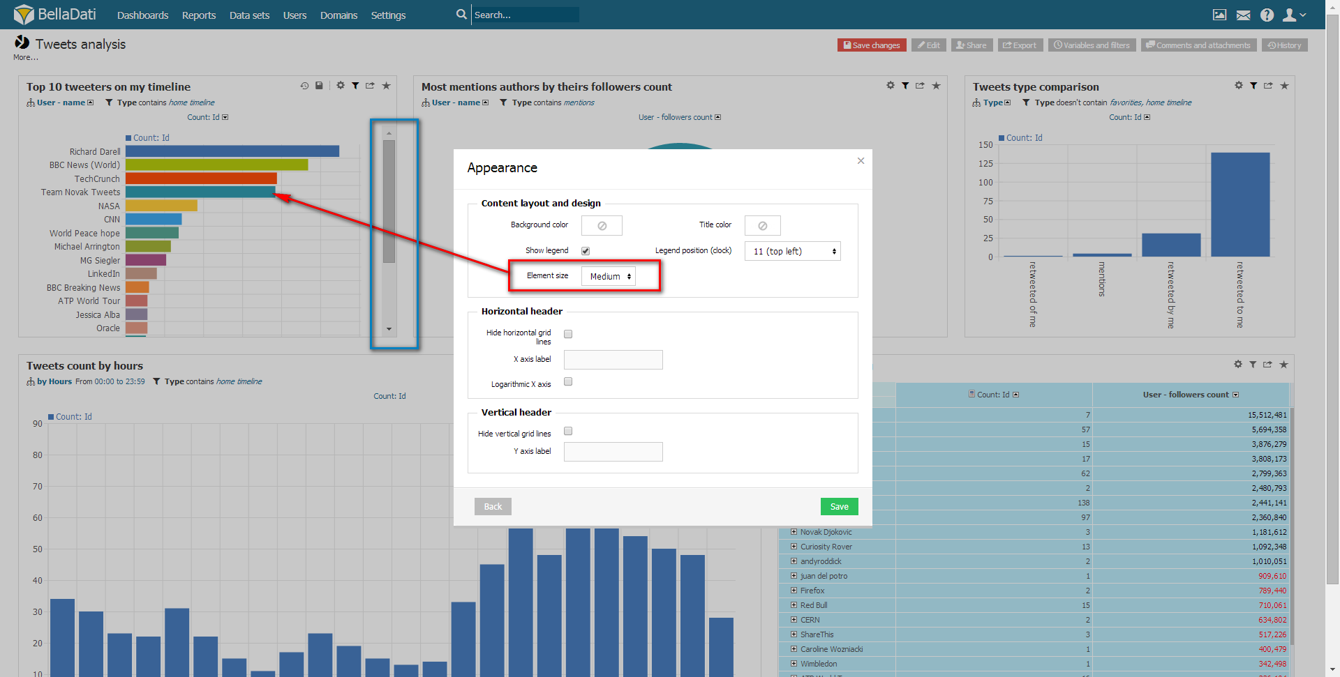
Displaying chart in "Scroll bar" mode
In case, your chart contains many elements (e.g. bars), and you won't let the system calculate the chart dimensions according to the view size, you can set the Element size parameter to specify the minimal element size. If the resulting size of chart is larger than current view size, scroll bars will appear. See the following example:
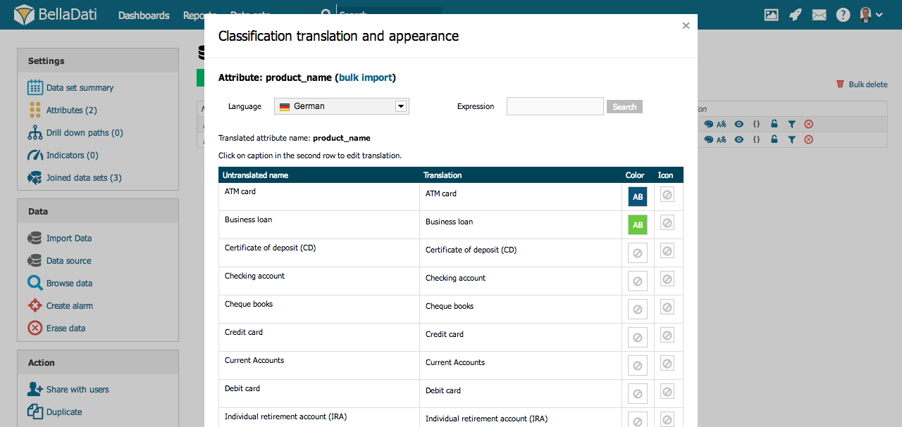
Attribute values appearance
Member appearance allows you to adjust and modify color, icon and translation of drill down members.
You can access Member appearance from Attribute selection dialog. Displayed members will refer to the attribute currently selected in the Add drill down path option.
Classification translation and appearance dialog enables:
- modifying node's font color and background
- assigning icon
- adjusting translations
These changes will affect all views and reports based on this data set. You must have editiong permissions to perform such changes.
See Members appearance and Attributes and members translation for more details.
Related content |
|---|
${xhtml} |
Overview
Content Tools