No Translation available yet
You have Slovak selected as language but this page has not been translated yet. Translate the page or view the content in the default space language below.
Display default
This form of conditional formatting is available for charts and maps only and it has a little different function in each case.
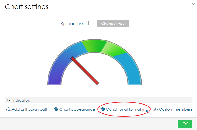
This type of conditional formatting is used for highlighting values on axis or scale, for example if you want to highlight some critical value. It is accessible from chart settings.
It is available for these charts:
- Bar chart
- Stack bar chart
- Line chart
- Horizontal bar chart
- Horizontal stack bar chart
- Combined chart
- Thermometer
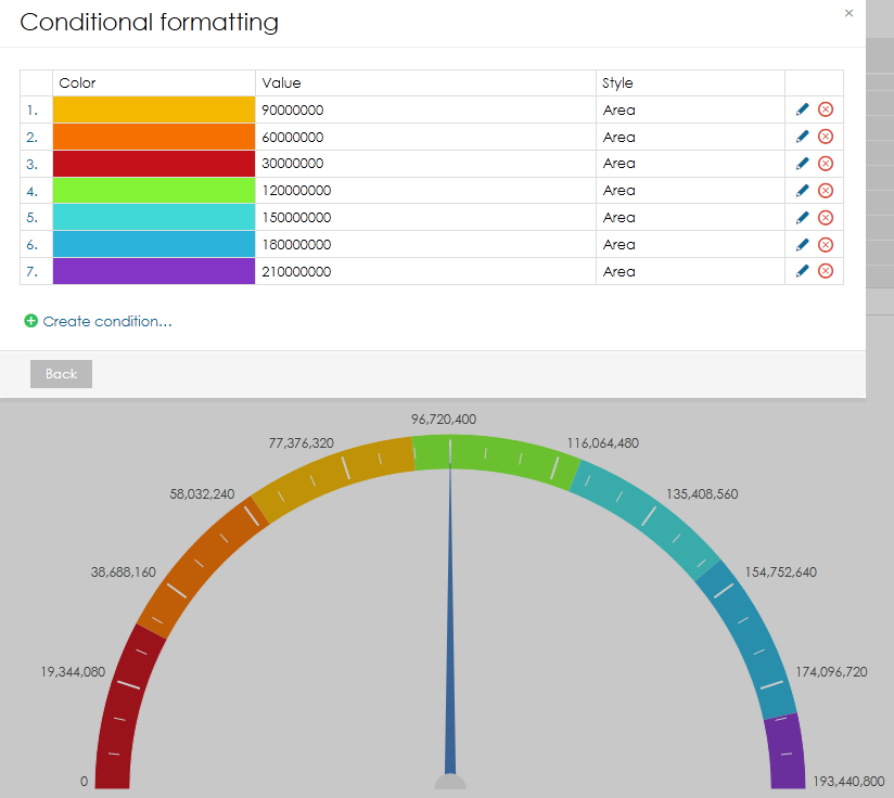
- Speedometer
- Bullet chart
- Horizontal bullet chart
- Formatting can be added by clicking on "Create condition"
- Select desired colour.
- Type value that will serve as top limit. Formulas can be used. That way you can easily specify quarters etc.
- Select style - line or area.
- Confirm by clicking on "Add".
It is possible to add multiple conditions. This way you can create beatiful scales.
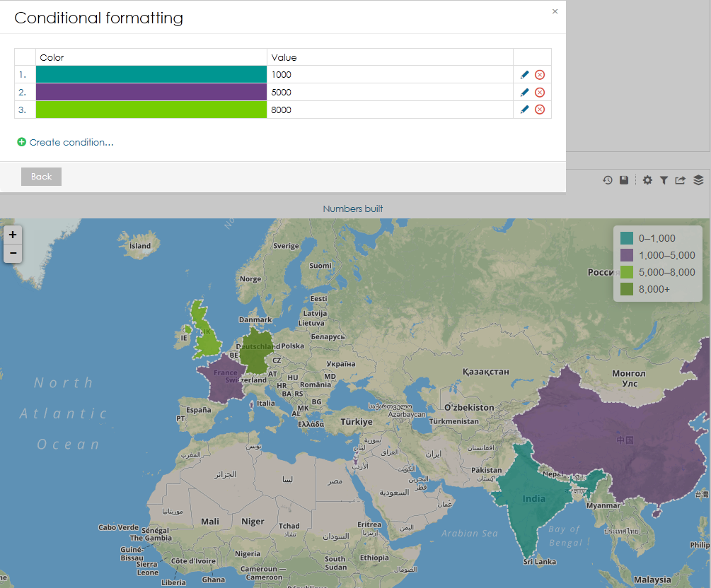
Conditional formatting in map is primarly used for creating custom color scale. The procedure is the same as in charts.
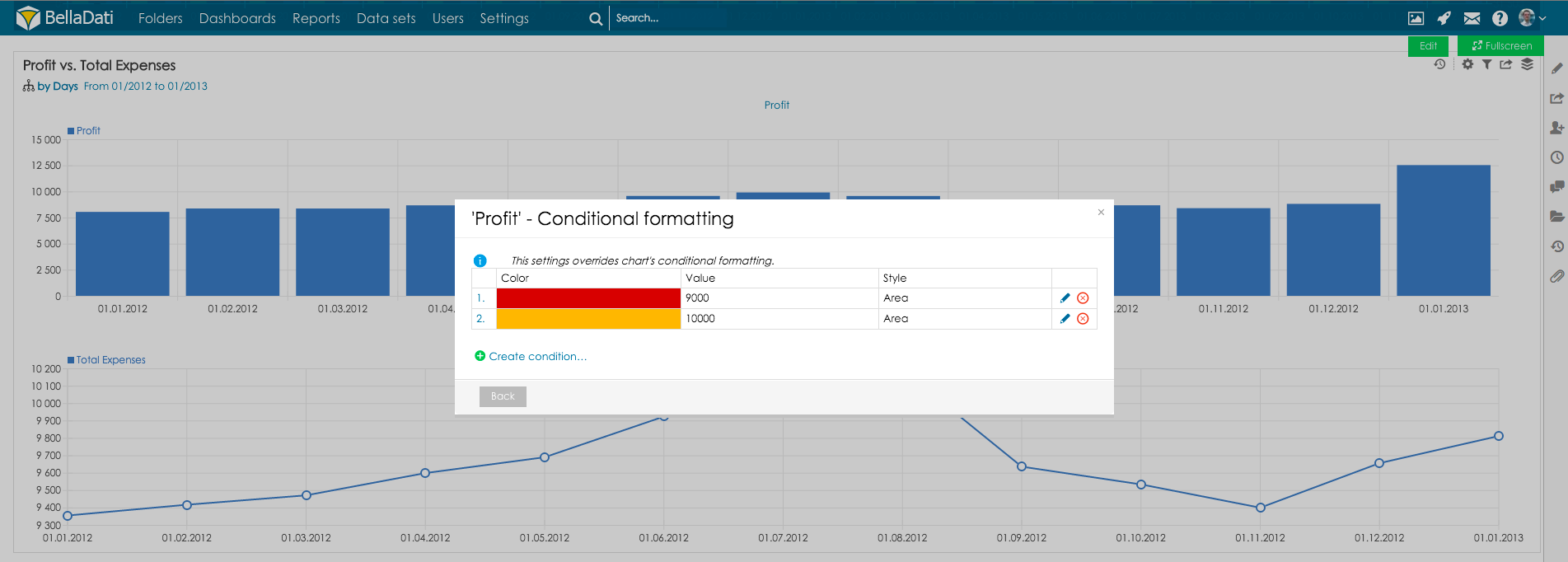
In some cases, you might like to define different conditional formatting for the views which contain multiple indicators.
This feature is accessible from indicator settings, select indicator and go to Chart - conditional formatting:
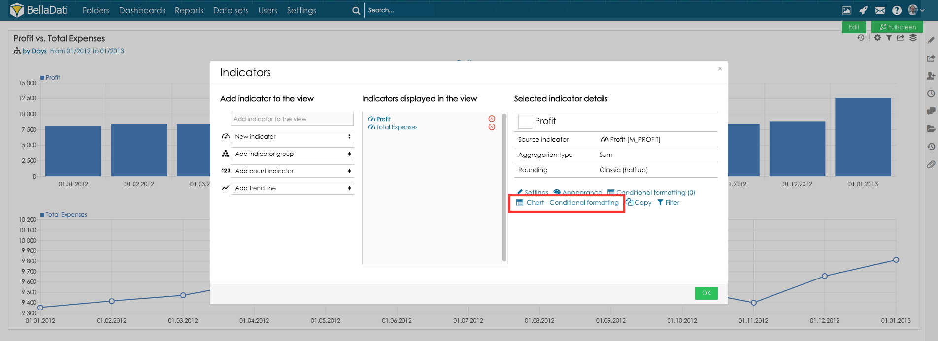
Now set conditional formatting in the same way as in chart conditional formatting: