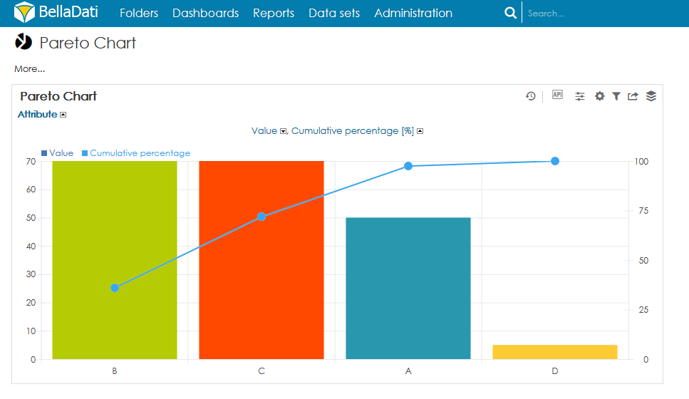
A Pareto chart is a type of chart that contains both a bar chart and a line chart. Individual values are represented in descending order by bars, and the cumulative percentage is represented by the line.
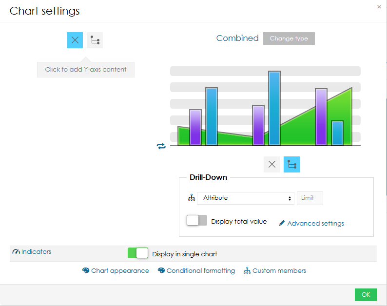
To create the Pareto chart in BellaDati, it is necessary to use a Combined chart and a formula indicator.
The Combined chart will use one drill-down on the x-axis.
To display the cumulative percentage, following formula needs to be used:
xVal=M_VALUE
xCumulative=0
xCount=0
xMember=memberValue('L_ATT')
xTotal=withoutDrillDown() {
    M_VALUE
}
withoutDrillDown() {
  eachMember('L_ATT') {
    if (M_VALUE>=xVal) {
        if (firstValue('L_ATT')==xMember) {
            xCumulative=xCumulative+M_VALUE
            xCount=1
        }
        else {
              if (xCount==1) {
            }
              else {
                   xCumulative=xCumulative+M_VALUE
                }
            }
          }
     }
}
return xCumulative/xTotal*100
The result:
You can download the sample BellaApp from here (compatible with BellaDati 2.9.13.2 and newer)
Overview
Content Tools

