Versions Compared

Key

  • This line was added.
  • This line was removed.
  • Formatting was changed.
Sv translation
languageen
Note

You need to be in edit mode in order to create new chart. Click on "Edit" in top report menu to activate edit mode.

Column

Basic tutorial

Chart in a graphic representation of various infromation and displays values of the indicators depending on user's criteria.

To add a new Chart hover over free place and click on Chart view type. The Add chart dialog box will appear.

Column
width200
Panel

On this page:

Table of Contents

Section
Column
  1. Select type of chart by clicking on one of thumbnails. BellaDati supports various chart types:
    • Pie chart
    • Bar chart
    • Stack bar chart
    • Line chart
    • Horizontal scatter chart
    • Scatter chart
    • Radial chart
    • Horizontal bar chart
    • Horizontal heat map
    • Candle chart
    • Thermometer
    • Funnel
    • Speedometer
    • Bullet chart
    • Horizontal bullet chart
    • Gantt chart
    • Combined (each indicator can be displayed differently): bar chart, stack bar chart, line chart, scatter chart

  2. Enter name of the new chart.

  3. Check Date interval if you need to restrict time period of displayed data - continue by Setting Date Interval .
  4. Add indicators into view from Indicators dialog box. Indicators dialog box is separated into three columns:
    • List of Available indicators
    • List of Indicators displayed in the view
    • Additional Indicator details


    For more information about Indicators continue by Displaying Indicators .
  5. Add drill-down by selecting one or more attributes. Drill-down is used for changing granularity according to the chosen drill-down path. The settings for drill-down is different for various charts:
    1. For most charts, you can set drill-down for both x-axis and y-axis. This applies for:
      • Bar chart
      • Stack bar chart
      • Line chart
      • Horizontal scatter chart
      • Scatter chart
      • Radial chart
      • Horizontal bar chart
      • Horizontal heat map
      • Combined
    2. Some chart allows only one drill-down:
      • Pie chart - you can also set secondary drill-down - use option Show details for.
      • Candle chart
      • Thermometer
      • Funnel
      • Speedometer
      • Bullet chart
      • Horizontal bullet chart
      • Gantt chart
    You can use two basic types of drill-down:
    1. Drill-down by regular attribute - use attributes such as City, Country, Department or Customer for changing granularity.
      Drill-down by date or time. You can place following date aggregations on the axis:

      For more information continue by Editing Chart Axes Content .
  6. Click OK to finish the creation of chart. Alternatively you can edit advanced settings and apperance of chart.

Chart management

You can perform additional operations in the upper right corner of the inserted Chart view:

Tip

Hover over Indicators in the toolbox list to quickly add or remove indicators. Hover over Drill down path in the toolbox list to quickly add or remove attributes.

Chart Settings

Click on toolbox icon or select Chart settings from the toolbox list to enter Chart settings dialog.

Each chart usually contains at least one indicator. Chart settings dialog allows you to:

Info

When more Indicators are added to the chart, they are displayed in separate charts within the view by default. Display in the single chart option forces them to be grouped into single chart.


Displaying Source Data

See how it works.

steps 
Sv translation
languagesk
Note

Pre vytvorenie novej tabuľky musíte byť v móde úprav. Kliknite na tlačítko "Upraviť" v hornej časti reportu a tak sa prepnite do módu úprav.

Section
Column

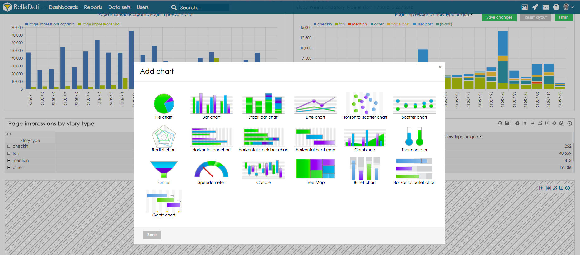
Pre pridanie nového grafu prejdite nad prázdnym miestom v reporte a z ponúknutých možností vyberte typ pohľadu Graf. Následne sa Vám zobrazí okno Nastavení grafu.

BellaDati podporuje viacero typov grafov:

  • Koláčový graf
  • Stĺpcový graf
  • Súčtový stĺpcový graf
  • Spojnicový graf
  • Horizontálny bodový graf
  • Bodový graf
  • Pavúkový graf
  • Horizontálny stĺpcový graf
  • Horizontálnu heat mapu
  • Burzový graf
  • Teplomer
  • Lievik
  • Tachometer
  • Kombinovaný (každý ukazovateľ bude zobrazený inak): buď ako stĺpcový, súčtový stĺpcový, spojnicový alebo bodový graf
Column
width300px
Panel

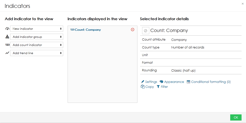
Na stránke nastavenia grafu sú dostupné:

  • Výber typu grafu
  • Správa grafu
  • Nastavenia grafu
  • Vetvenie
  • Vzhľad hodnôt atribútov
  • Vzhľad grafu


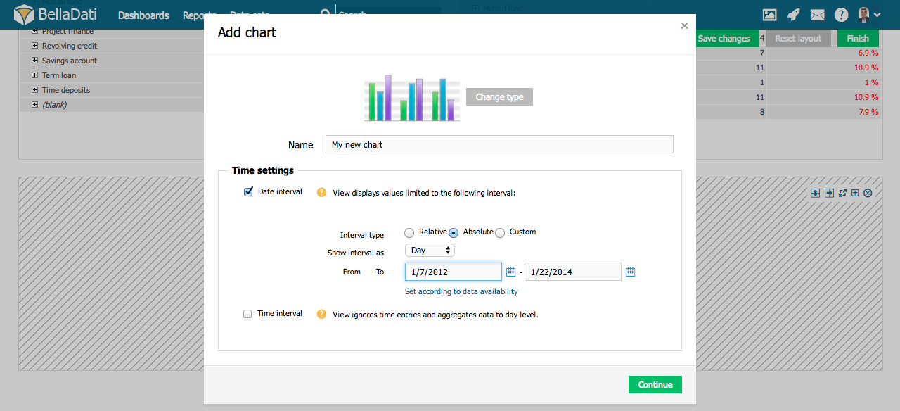
Vyberte požadovaný typ grafu. BellaDati Vás následne prevedie všetkými potrebnými nastaveniami.

  1. Zadajte názov nového grafu.
  2. Zaškrtnite interval dátumu ak chcete obmedziť časovú periódu zobrazených dát - pokračujte na nastavenie intervalu dátumu.
  3. Vyberte a upravujte ukazovatele zobrazené v grafe - pokračujte na zobrazovanie ukazovateľov.
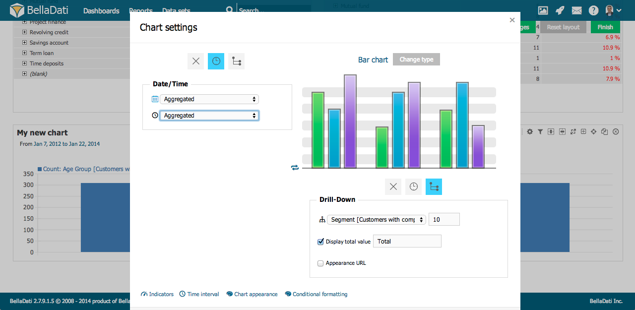
Správa grafu

V hornom pravom rohu nového grafu môžete vykonávať ďalšie operácie:

Tip

Pre rýchle pridávanie alebo odoberanie ukazovateľov prejdite myšou nad nástrojmi a následne nad položkou ukazovateľov. Rovnakým spôsobom môžete upraviť aj vetvenie.

Nastavenia grafov

Kliknite na ikonu nástrojov a vyberte Nastavenia grafu, následne sa Vám zobrazí okno Nastavenia grafu.

Každý graf zvyčajne obsahuje aspoň jeden ukazovateľ. Nastavenia grafu Vám umožňujú:

Info

V prípade prítomnosti viacerých ukazovateľov v jednom pohľade bude každý z nich zobrazený vo vlastnom grafe. Toto nastavenie je možné zmeniť v Nastaveniach grafu - možnosť "zobraziť všetky ukazovatele v jednom grafe".


Zobrazenie zdrojových dát

Pre informácie o zobrazovaní zdrojových dát kliknite sem.

Kam ďalej

...