Page History
| Sv translation | |||||||||||||||||||||||||||||||||||||||||||||
|---|---|---|---|---|---|---|---|---|---|---|---|---|---|---|---|---|---|---|---|---|---|---|---|---|---|---|---|---|---|---|---|---|---|---|---|---|---|---|---|---|---|---|---|---|---|
| |||||||||||||||||||||||||||||||||||||||||||||
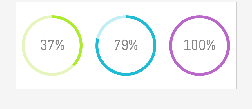
In this tutorial you will obtain data from existing BellaDati chart view using Client API and create a custom visualization. Result will look like this:
Tutorial parts:
Working with BellaDati ExtensionsBefore you start with Client API you have to learn how create BellaDati Extension. Extensions allow you to to customize BellaDati front-end functions or create custom content like charts or dashboards.
Extensions consist of three parts: External JavaScript libraries, code that is appended to the end of head element content and code that is appended to the beginning of body.
First give your extension a name.
Next create layout of the Extension where the custom chart will be placed:
Then style the layout:
Extension is now created so you can continue with the next part.
Getting data from BellaDatiThis example is based on Speedometer chart. To keep it simple you will work only with one indicator value. For this case let's assume that there is a formula indicator calculating a percentage value - so the value you get is always in 0 - 100 range.
You can download this BellaApp and upload it into BellaDati. It contains data set and report created following steps below.
Everything is now ready so you can start with getting the data from the chart view.
Click on the view from which you want to get a value with right mouse button and select "Inspect".
You can find the view's ID in the element of this view. It looks like "8313-0dt2jiMsXY" with "8313" being ID of the report and "0dt2jiMsXY" being ID of the view.
Now to loading the data. Create a function with Ajax call to get data from the chart using the viewDetail endpoint so it can be later used for rendering a chart. See http://support.belladati.com/techdoc/Report+API for all Report API endpoints.
Chart data are returned in a JSON and the indicator value can be accessed using this path:
Check in the JavaScript console if your code is correct and you can see the value of the indicator from the chart.
Creating custom chartNow that you have the value you can start building a chart. In this example is a simple gauge created using HTML5 canvas. In this custom chart the value you get from a chart is used to calculate radius of the gauge that will be filled and is also displayed as a percentual value inside of the gauge. The value is rounded to the nearest integer to make it more clean in this example. createGauge function that creates the chart has 4 parameters. ID of the canvas element in your Extension, ID of the chart view in BellaDati, color of the Guage background and color of the space that is filled.
Create gauges in canvas elements using these parameters:
As the last step add font that is used inside of the gauge:
You have created a view with multiple charts displaying live data from BellaDati. This view can be used for example in custom reports or dashboards. Complete code is available here - End of Head + Beginning of body. |


| Sv translation | |||||||||||||||||||||||||||||||||||||||||||||
|---|---|---|---|---|---|---|---|---|---|---|---|---|---|---|---|---|---|---|---|---|---|---|---|---|---|---|---|---|---|---|---|---|---|---|---|---|---|---|---|---|---|---|---|---|---|
| |||||||||||||||||||||||||||||||||||||||||||||
このチュートリアルでは、クライアントAPIを使用して、既存のBellaDati可視化ビューからデータを取得し、カスタムグラフを作成する。 その結果がこのようなダッシュボードに統合される。
チュートリアルパーツ:
BellaDati拡張機能で作業クライアントAPIで開始する前に、BellaDatiエクステンションを作成方法を学習する必要がある。 拡張機能を使用すると、BellaDatiフロントエンド機能をカスタマイズしたり、チャートやダッシュボードなどのカスタムコンテンツを作成することを可能にする。
拡張機能は、3つの部分で構成されている:外部JavaScriptライブラリ、コード本文の先頭に追加されたヘッド素子コンテンツや末尾に追加されたコード。
まず、あなたの拡張機能に名前を付ける。
次のカスタムチャートが配置される拡張機能のレイアウトを作成する。
その後レイアウトのスタイルする
拡張が次の部分を続けることができるように作成されない。
BellaDatiからデータを取得この例では、スピードメーターチャートに基づく。シンプルに唯一のインジケータ値で動作することだけ この例に対してあなたが得る値は0- 100の範囲このケースでのがパーセント値を計算式インジケータがあると仮定しましょう。
このBellaAppをダウンロードして、BellaDatiにそれをアップロードできる。これはデータセットが含まれて、作成したレポートが次の手順の通りです。
すべての準備が整いましたのであなたがチャートビューからデータを取得して起動できる。
マウスの右ボタンで値を取得したいビューフォームをクリックして、「Inspect」を選択する。
あなたは、このビューの要素にビューのIDを見つけることができる。それは、「8313-0dt2jiMsXY」と「8313」レポートのあるIDとビューの「0dt2jiMsXY」というIDのように見える。
今すぐデータをロードする。 それは後でチャートを描画するために使用することができるようviewDetailエンドポイントを使用してグラフからデータを取得するためにAjax呼び出しを持つ関数を作成する。すべてのレポートのAPIエンドポイントのhttp://support.belladati.com/techdoc/Report+APIを参照してください。
チャートデータはJSONで返され、指標値はこのパスを使用してアクセスできる。
あなたのコードが正しいかどうかのJavaScriptコンソールで確認してください、あなたは、チャートからのインジケータの値を見ることができる。
カスタムチャート作成
今、あなたが値を持って、チャートの構築を開始できる。 この例では、HTML5のキャンバスを使用することで作成された簡単なゲージです。 このカスタムでチャートから取得する値がゲージの内側パーセント値として表示されるゲージの半径を計算するために使用される。 この例では、よりきれいにするために、値が最も近い整数に丸められる。 チャートを作成するcreateGauge機能は4つのパラメータがある。あなたの拡張機能でcanvas要素のID、BellaDatiにチャートビューのID、ゲージの背景の色と空間での色が満たされた。
これらのパラメータを使用して、canvas要素でゲージを作成する。
最後のステップとして計の内部で使用されているフォントを追加する。
あなたはBellaDatiからライブデータを表示する複数のチャートを持つビューを作成した。このビューは、カスタムレポートやダッシュボードの例に使用できる。 |
Overview
Content Tools