BellaDatiでは、画面上のほぼすべての要素の外観を変更できます。この例では、どのようにフィルタ部品の外観を変更する方法を表示します。終わりに、最後に基本的なラジオボタンがクリック可能なボタンに変換されます。 HTMLやCSSの知識が必要です。
用意
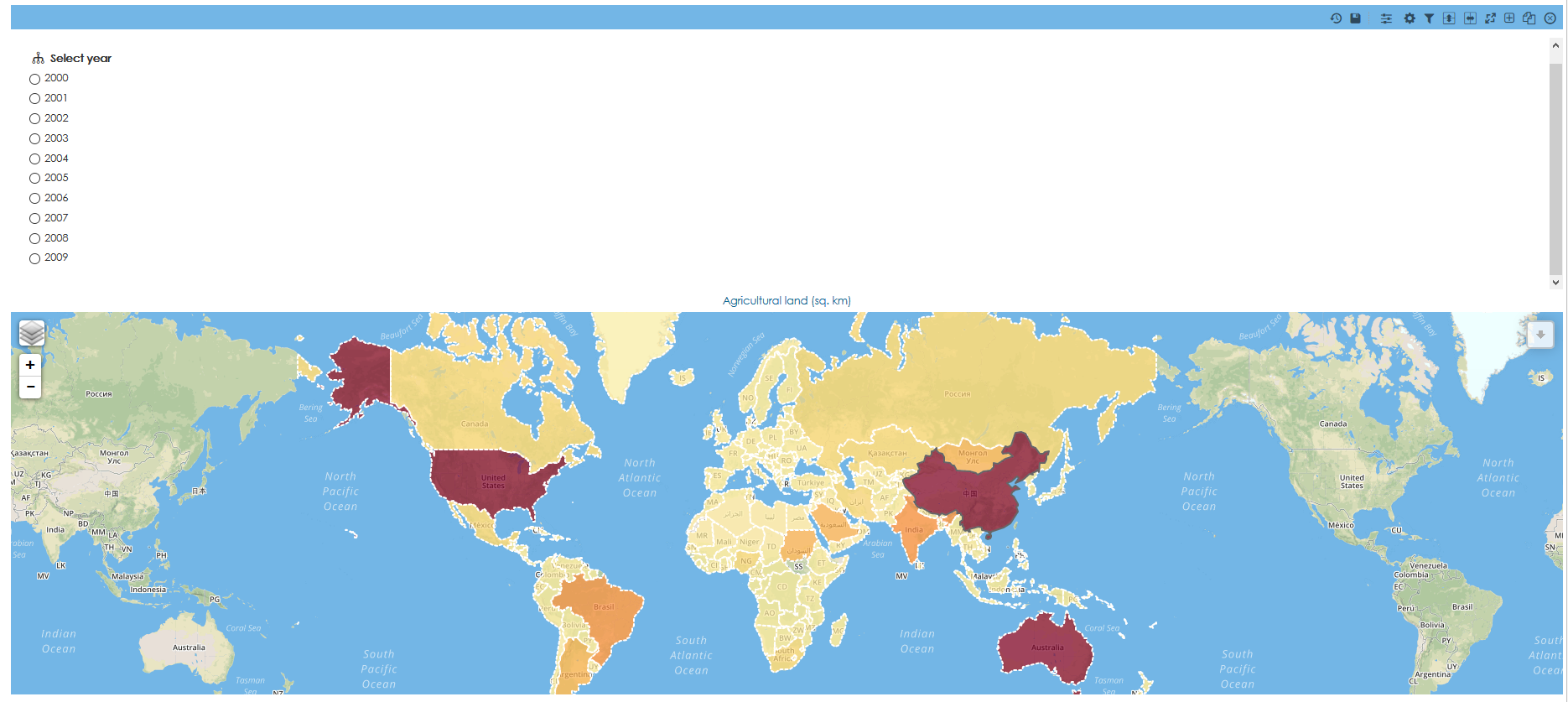
ラジオボタンコンポーネントを使用したフィルタが含まれるレポートを作成します。この例では、フィルタ内部のビューが使用されますが、他のタイプのフィルタにも同様のアプローチを使用できます。デフォルトでは、次のようになります。
CSSカスタマイズ
ルックアンドフィールドメインの設定を使用するかカスタムコンテンツにコードを追加することでカスタムCSSを追加することが可能です。1つのレポートだけに変更を適用したいので、この場合にはカスタムコンテンツが使用されます。
すべての変更は、ソースモードで実行されます。そうでなければ、コードは動作しません。
レポートに新しいカスタムコンテンツを追加します。
ソースモードに切り替えます。
ラジオボタンを非表示にし、一列にすべてのオプションを整列します。
 <style>
input[type="radio"],
input[type="checkbox"] {
    /* hide the inputs */
    opacity: 0;
}
.no-slider form div p {
  display:inline-block;
}
.no-slider form div {
	max-width:900px !important;
	border:0px !important;
	padding-bottom: 0px !important;
    margin-top: 0px !important;
    padding-top: 0px !important;
}
.no-slider {
	overflow:unset !important;
}
</style>
ボタンとして動作するようにラベルにスタイルを追加します。
/* style your lables/button */
input[type="radio"] + label,
input[type="checkbox"] + label {
    /* keep pointer so that you get the little hand showing when you are on a button */
    cursor: pointer;
    /* the following are the styles */
    padding: 4px 10px;
    border: 1px solid #FF8254;
    background: #FF8254;
    color: #fff;
    width: 40px;
	display: block;
	margin-left: 10px;
	text-align: center;
	font-size: 15px;
	text-rendering: unset;
	text-rendering: optimizelegibility !important;
}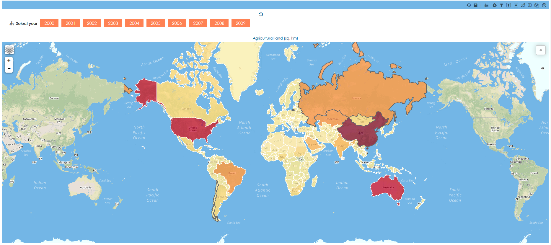
シャドウ、角丸や遷移など、高度なスタイルオプションを追加すできます。
box-shadow: 1px 2px 4px #888888;
transition: all 0.6s ease 0s;
text-shadow: 1px 1px 1px rgba(200, 200, 200, 0.5);
text-rendering: optimizelegibility !important;
border-radius: 3px;

選択された項目に別のスタイルを追加します。
input[type="radio"]:hover + label,
input[type="checkbox"]:hover + label {
    border: 1px solid #DE594B;
    background: #DE594B;
}
input[type="radio"]:checked+ label,
input[type="checkbox"]:checked+ label{
    /* style for the checked/selected state */
    background: #ECC34D;
    border: 1px solid #ECC34D;
    color: white;
}
今、完全に動作する ボタンがあります。もちろんレポートの外観を変更することが可能です。この例では、マップと同じになるように背景を変更し、フィルタの名前を非表示になります。
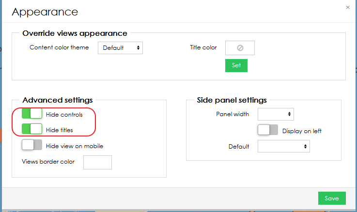
#contentNarrower, .textViewContainer,.leaflet-container { background-color: #73B6E6!important; } .viewContentInnerLayout { background-color: #73B6E6 !important; } .t-bdlayout-space { border: 1px solid #73B6E6 !important; }- 最後に、レポートの外観設定ですべてのレポートコントロールとトップバーを非表示になります。
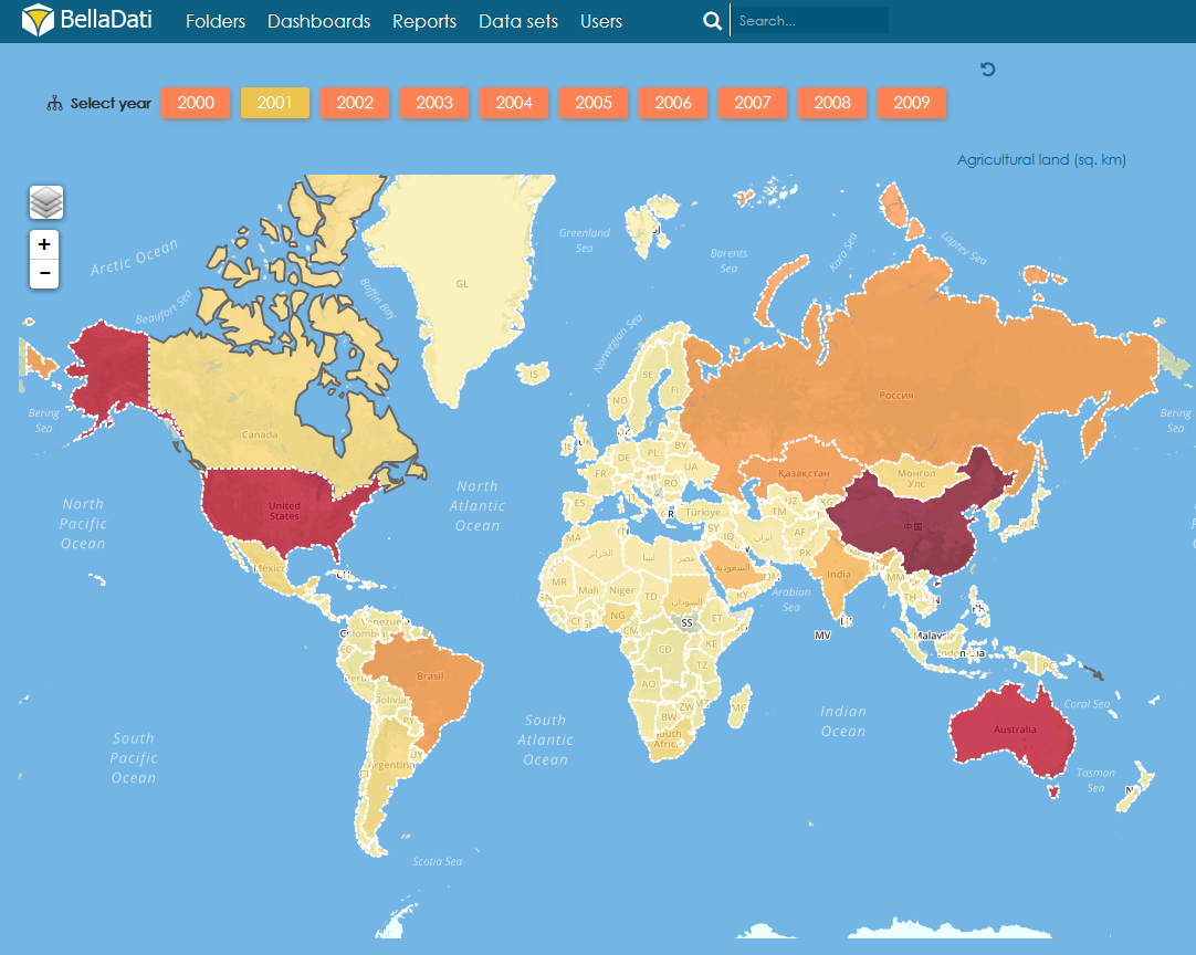
- これは、最終的な結果です
CSS コード完了:
<style> input[type="radio"], input[type="checkbox"] { /* hide the inputs */ opacity: 0; } .no-slider form div p { display:inline-block; } .no-slider form div { max-width:900px !important; border:0px !important; padding-bottom: 0px !important; margin-top: 0px !important; padding-top: 0px !important; } .no-slider { overflow:unset !important; } /* style your labels/button */ input[type="radio"] + label, input[type="checkbox"] + label { /* keep pointer so that you get the little hand showing when you are on a button */ cursor: pointer; /* the following are the styles */ padding: 4px 10px; border: 1px solid #FF8254; background: #FF8254; color: #fff; width: 40px; display: block; margin-left: 10px; text-align: center; font-size: 15px; text-rendering: unset; box-shadow: 1px 2px 4px #888888; transition: all 0.6s ease 0s; text-shadow: 1px 1px 1px rgba(200, 200, 200, 0.5); text-rendering: optimizelegibility !important; border-radius: 3px; } input[type="radio"]:hover + label, input[type="checkbox"]:hover + label { border: 1px solid #DE594B; background: #DE594B; } input[type="radio"]:checked+ label, input[type="checkbox"]:checked+ label{ /* style for the checked/selected state */ background: #ECC34D; border: 1px solid #ECC34D; color: white; } #contentNarrower, .textViewContainer,.leaflet-container { background-color: #73B6E6!important; } .viewContentInnerLayout { background-color: #73B6E6 !important; } .t-bdlayout-space { border: 1px solid #73B6E6 !important; } </style>添付られたBellaApp で最終報告書とフィルタの他の例を見つけることができます。
Overview
Content Tools