Connector SDK 1.0+ and BellaDati 2.9.7+ advanced connector behavior can be provided as metadata.
Metadata allows you to define:
- Connector name and description
- Connector logo
- Wizard mode
- Steps with name and description
- Elements of various types: input fields, HTML code, links
Using metadata
Metadata are defined as org.json.JSONObject instance and are returned by static getMetadata() method defined in your custom connector DataProviderApi implementation class.
public class MyDataProvider extends DataProviderApi<RowsApi<? extends RowApi>> {

...

	public static org.json.JSONObject getMetadata() {
		...
	}

...
}
Metadata properties
| Field | Type | Description | Example |
|---|---|---|---|
name | String | Name of the connector displayed on the data sources page. Overrides the value returned by getName() method. |  |
description | String | Description of the connector displayed on the data sources page | |
logo | String | Path to the logo 64x64px image file. Should be placed inside the same package as custom connector main class. | |
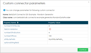
wizard | Boolean | Determines whether the connector settings should be displayed in wizard mode. If true, content of steps element are then used to define particular step content. Window with parameters otherwise. | Properties mode:
Wizard mode:
|
| keys | String | Keys support translations of names, descriptions, and values. The reference to the is defined by using message:prefix, e.g. message:key1. {
"name" : "Custom connector",
"description" : "This is custom data connector",
"wizard" : true,
"keys" : {
"default" : { "key1" : "label 1", "key2 : "label 2" },
"cs" : { "key1" : "cs label 1", "key2 : "cs label 2" },
"de" : { "key1" : "de label 1", "key2 : "de label 2" }
}
}
If no value is found, the default is used. If no default is specified, value with the prefix is displayed. | |
steps | Array of Objects | Contains steps of which the connector settings wizard is composed | |
steps[].index | Integer | Index of the step | |
steps[].name | String | Name of the step | |
steps[].description | String | Description of the step | |
steps[].elements[] | Array of Objects | Contains elements that are displayed after each other inside the table with two columns. | |
steps[].elements[].id | String | ID of the element, is stored in data-id attribute. |
Values of all elements are stored in hidden <span> elements below the step description: <div style="display:none"> <span data-value="false" data-id="el_9"></span> <span data-value="tests" data-id="el_5"></span> <span data-value="second value" data-id="el_2"></span> <span data-value="test" data-id="el_1"></span> </div> |
steps[].elements[].label | String | Label of the element. Content of <th> element | |
steps[].elements[].type | String | Type of the element. Available element types:
| |
steps[].elements[].property | String | Property corresponding to PropertyValueApi provided by DataProviderApi implementation. Collected input values from elements are stored to these properties. | |
steps[].elements[].value | String | Default value | |
steps[].elements[].values | Array | Contains values that are displayed in the select and radio fields. Supported in element types:
| .. "values" : [ "a", "b" ], .. |
steps[].elements[].required | Boolean | (Optional) Determines whether the field is required or not. If true, the user required to enter the values in this field. Empty means false. |

Metadata JSON example
{
"name" : "Custom connector",
"description" : "This is custom data connector",
"wizard" : true,
"steps" : [
{
"index":1,
"name":"First step",
"description":"Some description",
"elements":[
{"id":"el_1","label":"Text element","value":null,"type":"INPUT_TEXT", "required":"true"},
{"id":"el_2","label":"Select element","values":["first value;second value"],"value": "first value","type":"INPUT_SELECT"},
{"id":"el_3","label":"Link element","value":"http://www.belladati.com","type":"LINK"},
{"id":"el_4","label":"HTML element","value":"<h2>This is html element</h2>","type":"HTML"}
]
},
{
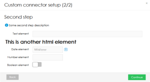
"index":2,
"name":"Second step",
"description":"Some second step description",
"elements":[
{"id":"el_5","label":"Text element","value":null,"type":"INPUT_TEXT"},
{"id":"el_6","value":"<h1>This is another html element</h1>","property":"HTML element","type":"HTML"},
{"id":"el_7","label":"Date element","value":null,"type":"INPUT_DATE"},
{"id":"el_8","label":"Number element","value":null,"type":"INPUT_NUMBER"},
{"id":"el_9","label":"Boolean element","value":null,"type":"INPUT_BOOLEAN"}]
}
]
}
Advanced implementation
Implementing AJAX callbacks
If you need external window (e.g. for authentication), you can use callback function provided by BellaDati:
put javascript code as HTML element (type = HTML) in appropriate step
<script type="text/javascript">
    window.callback_SOMENAME = function(params) {
        //do something
    }
</script>
use following callback URL:
http://your_host:port/auth/callback/SOMENAME
Overview
Content Tools