You need to be in edit mode in order to create new chart. Click on "Edit" in top report menu to activate edit mode.
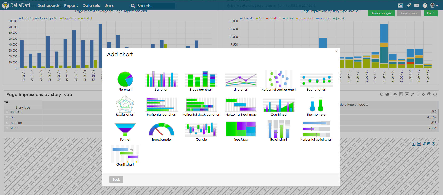
To add a new Chart hover over free place and click on Chart view type. The Add chart dialog box will appear.
BellaDati supports various chart types:
- Pie chart
- Bar chart
- Stack bar chart
- Line chart
- Horizontal scatter chart
- Scatter chart
- Radial chart
- Horizontal bar chart
- Horizontal heat map
- Candle chart
- Thermometer
- Funnel
- Speedometer
- Combined (each indicator can be displayed differently): bar chart, stack bar chart, line chart, scatter chart
On this page:
- Chart view types
- Chart management
- Chart settings
- Drill down path
- Member appearance
- Chart appearance
Select desired chart type. BellaDati will guide you through additional setup.
- Enter name of the new chart.
- Check Date interval if you need to restrict time period of displayed data - continue by Setting Date Interval.
- Select and edit Indicators displayed in the chart - continue by Displaying Indicators.
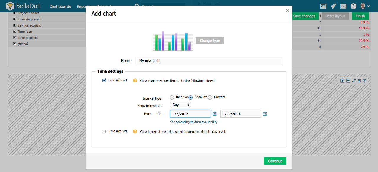
Chart management
You can perform additional operations in the upper right corner of the inserted Chart view:
- Chart settings
- Drill down paths
- Indicators
- Chart appearance
- Filter setting - continue by Using Filters
- Export view - continue by Exporting View
- Add to dashboard
- Move chart
- Duplicate chart
- Delete chart
Hover over Indicators in the toolbox list to quickly add or remove indicators. Hover over Drill down path in the toolbox list to quickly add or remove attributes.
Chart Settings
Click on toolbox icon or select Chart settings from the toolbox list to enter Chart settings dialog.
Each chart usually contains at least one indicator. Chart settings dialog allows you to:
- Edit Indicators
- Change type of the chart
- Add Time axis - continue by Setting Date Interval
- Editing Chart Axes Content
- Change Chart appearance
- Edit Conditional formatting
- Force indicators to Display in the single chart
When more Indicators are added to the chart, they are displayed in separate charts within the view by default. Display in the single chart option forces them to be grouped into single chart.
Displaying Source Data
See how it works.
Next steps
Overview
Content Tools